
NJ Transit App Redesign
Conceptual redesign of the NJ Transit mobile application, to optimize clarity and east of use by focusing on user research, information architecture, and interface redesign.
Role
UI/UX Designer, User Researcher
Tools
Figma, Adobe Illustrator, Google Docs, Behance, Dribble.
Timeline
4 weeks (2026)
Project Type
Concept UI/UX App Redesign
Overview
The NJ Transit app serves thousands of commuters traveling throughout New Jersey and into New York City. Despite its critical role in daily transportation, the app’s current interface leaves users confused when they need clear information the most.
With the goal of rethinking the app experience through research-driven design this project aimed to improve usability, clarity, and overall rider confidence, especially while in transit.
The Problem
Users struggle to find and understand bus and train schedule information. They are frustrated with inaccurate/a lack of real-time location information. Many also mentioned that the app is not beginner-friendly and assumes prior knowledge of how the transit system works.
Key issues included:
Hard to find schedule information
Poor visibility of live updates
Too many steps to complete simple tasks
Limited guidance for infrequent riders
The Objective:
To redesign the NJ Transit App to create a more user-friendly experience where travelers easily access information about schedules, tickets, and a bus or train’s location with fewer steps and clearer visual hierarchy.

Empathize
Understanding users through research to uncover needs and pain points.
Define
Turning insights into clear problems and focused direction.
Ideate
Brainstorming and exploring potential design solutions.
Prototype
Creating tangible designs and testable ideas.
Testing
Gathering feedback and refining for usability.
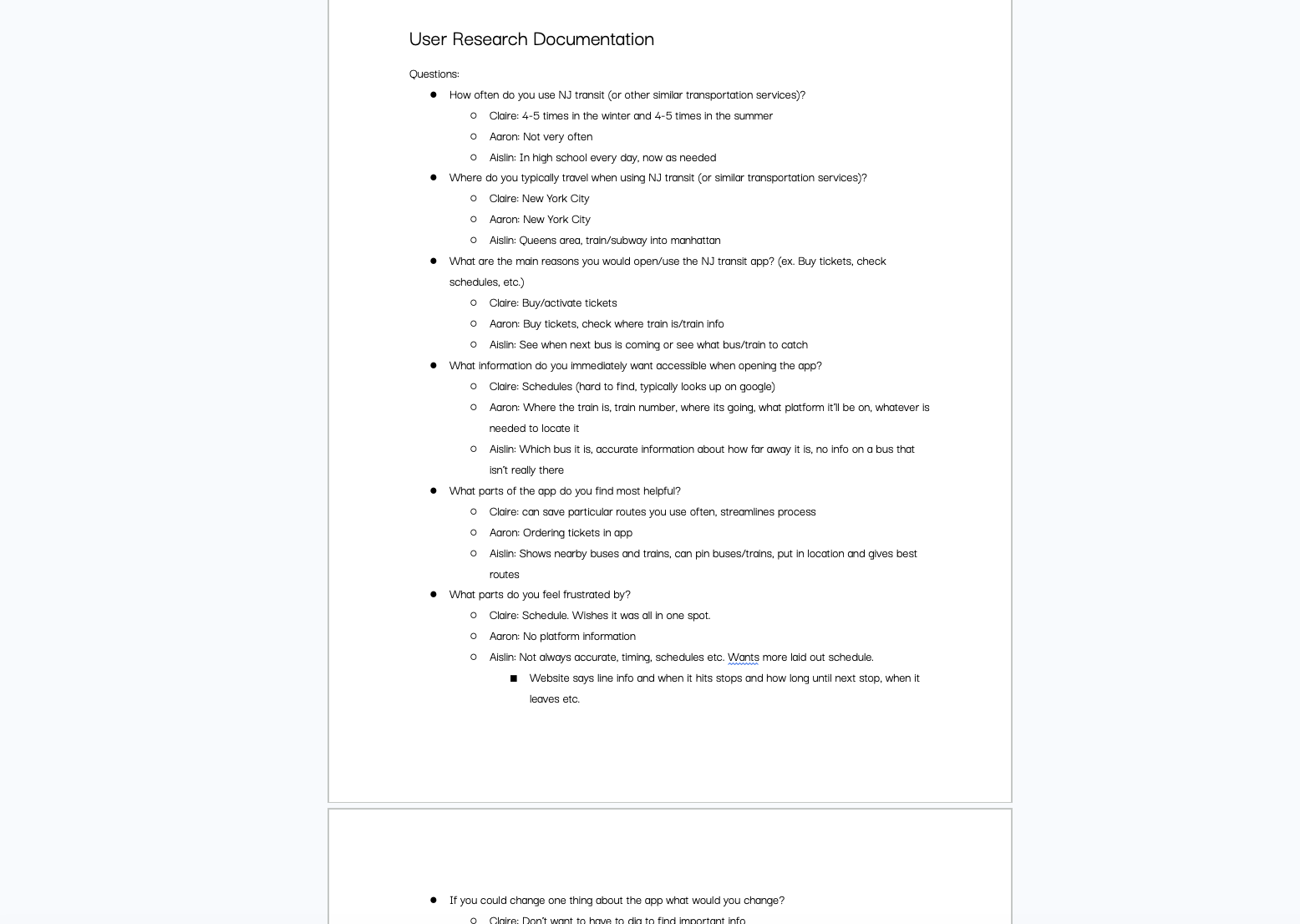
User Research
I conducted user research with transit users to get insight into how people interact with transportation services like NJ Transit or other similar apps. Participants included both frequent commuters and occasional riders. My goal was to understand not only what users were doing in the app, but how they felt while using it.
Affinity Diagram
Findings from my user research were synthesized into an affinity diagram broken down into:
Travel habits
Favorite features
Least favorite features
Suggestions for improvement
These categories helped identify common frustrations and clearly identify which areas of the app needed to be addressed in the redesign.
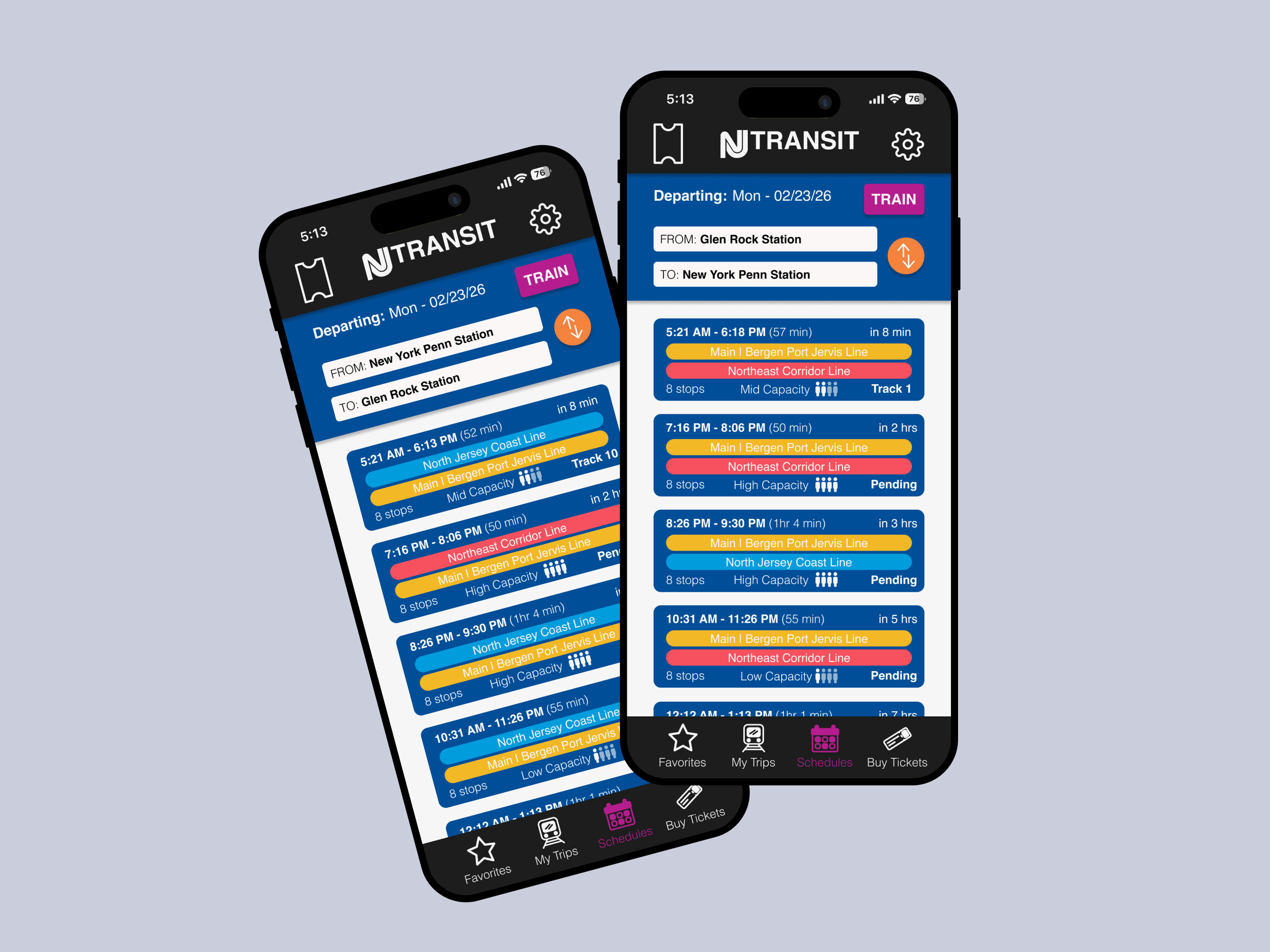
Information Architecture
Using insights from my research, I restructured NJ Transit's information architecture. This step was necessary to simplify the user experience while working through existing navigation issues. By restructuring I was able to make crucial information easier to find, create clearer content groupings and eliminate redundant pathways.
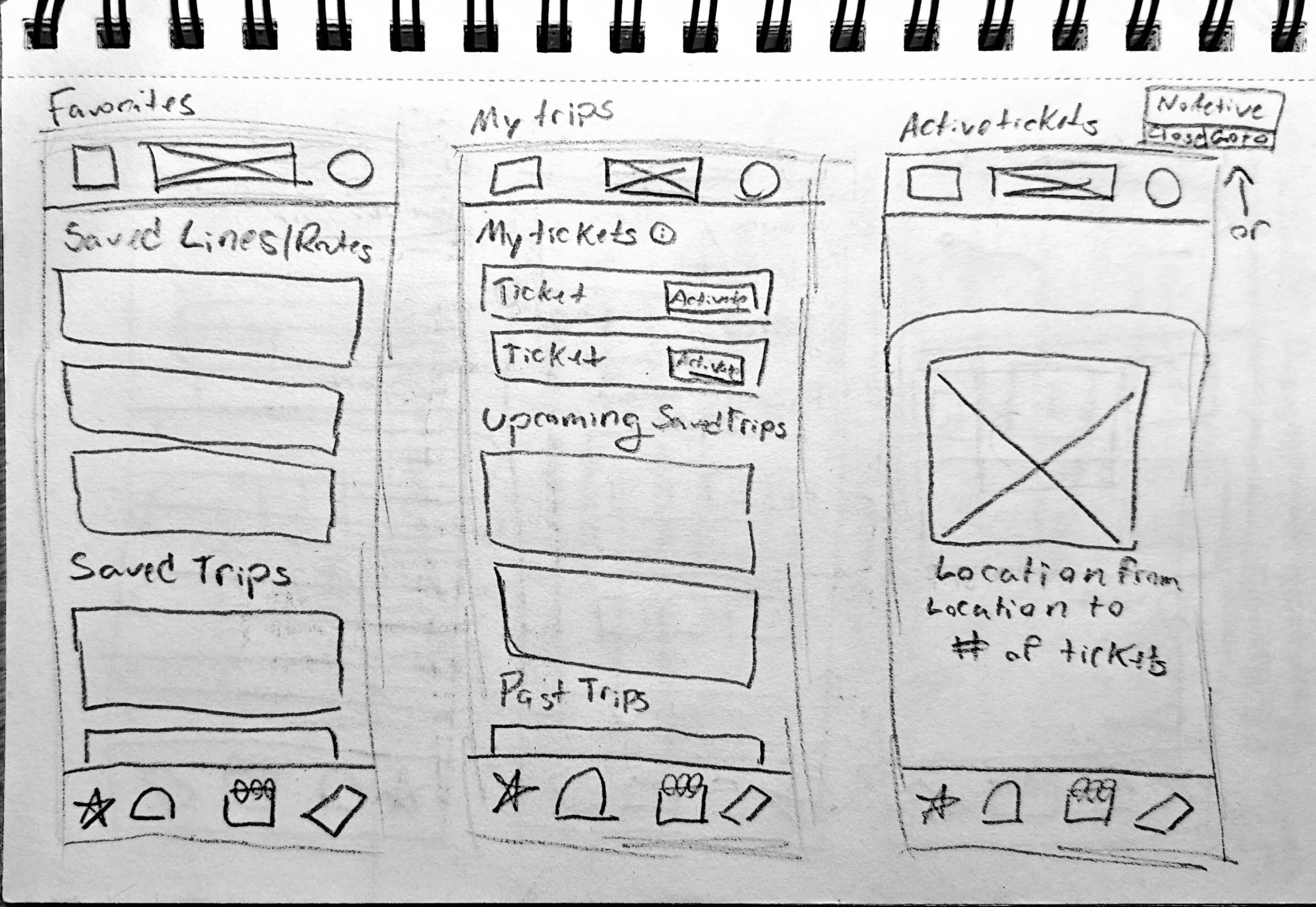
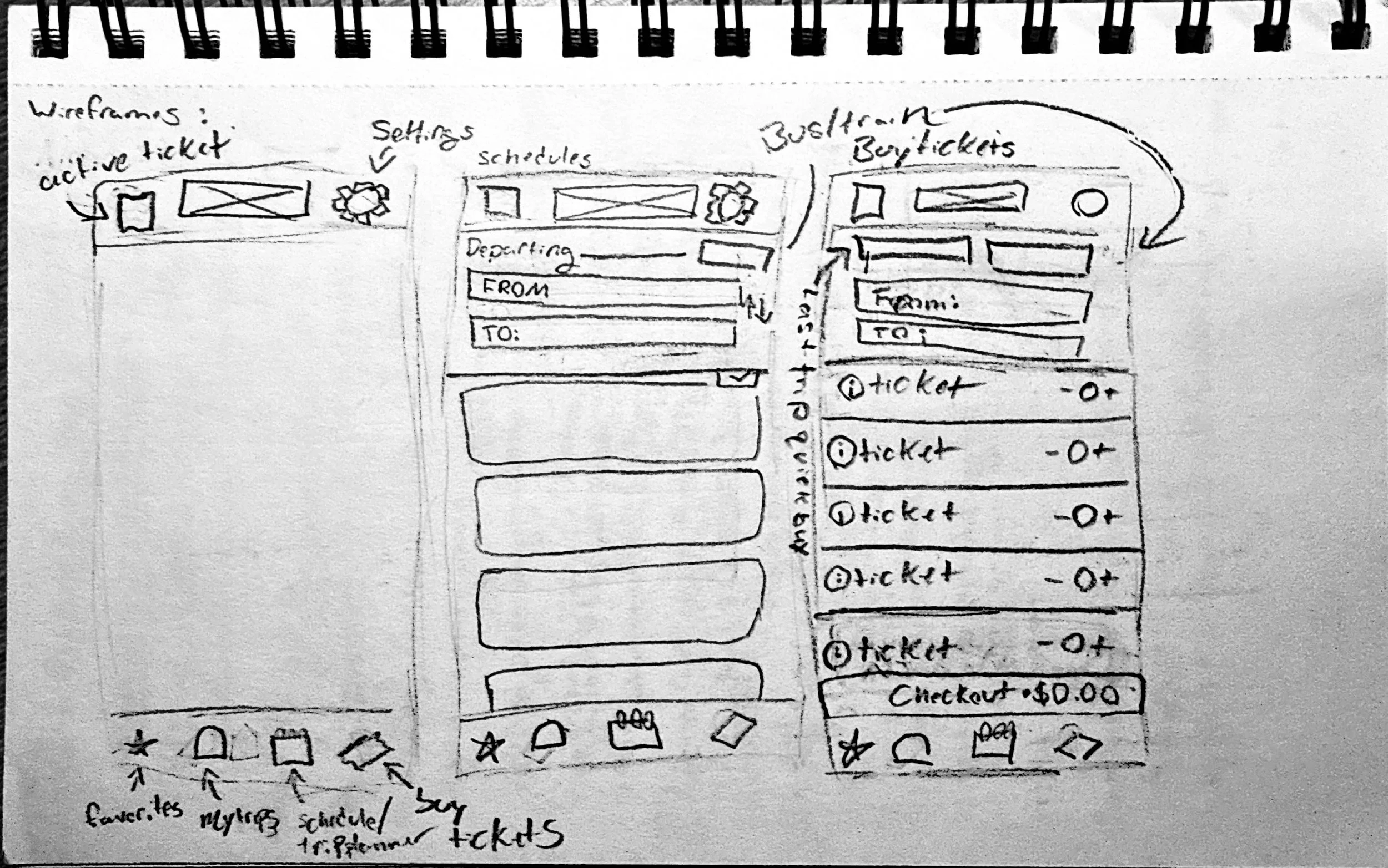
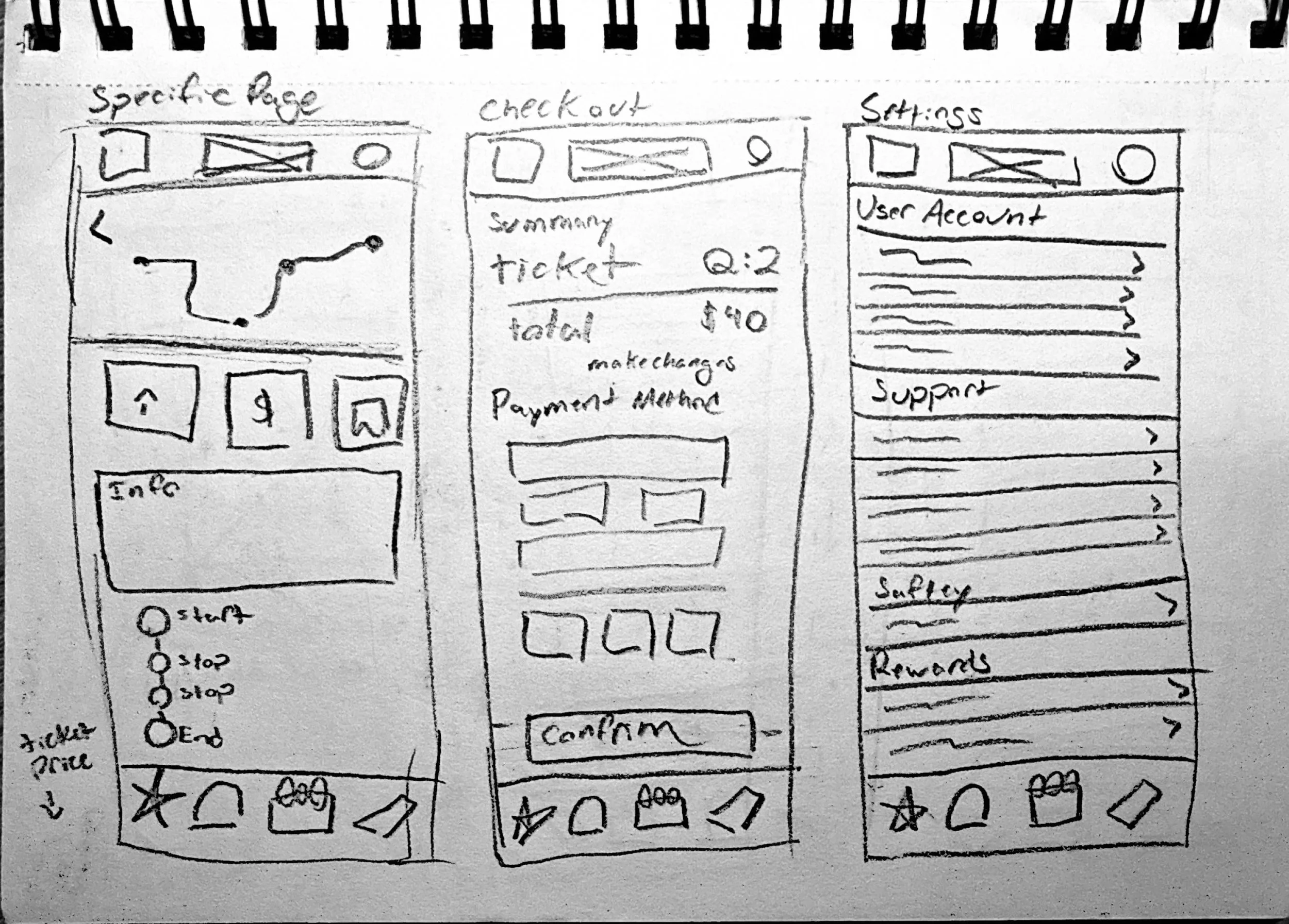
Sketches
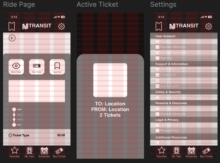
Initial low fidelity sketches to test concept layouts centered around a clearer schedules page, trip page, and faster ticket access with streamlined information.
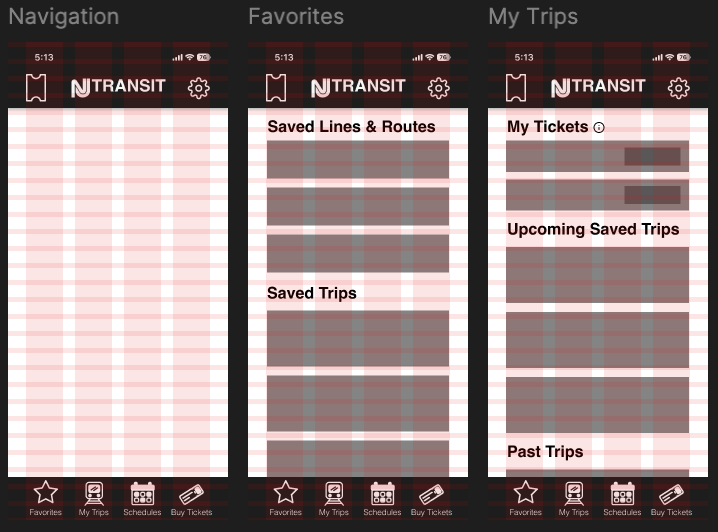
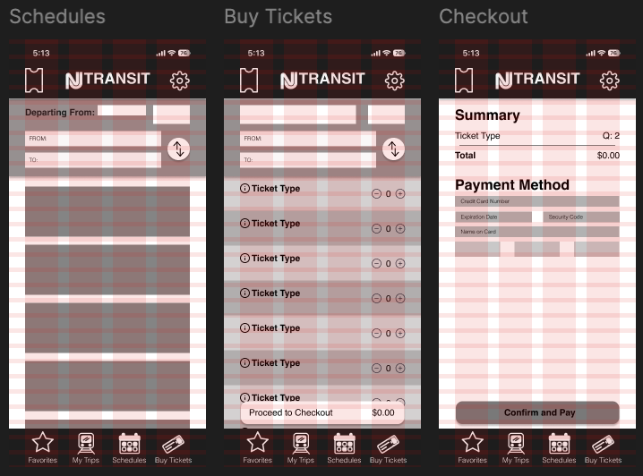
Wireframes
The sketches were translated into digital wireframes in Figma, where I refined the placement, scale, and prominence of buttons and key interface elements.
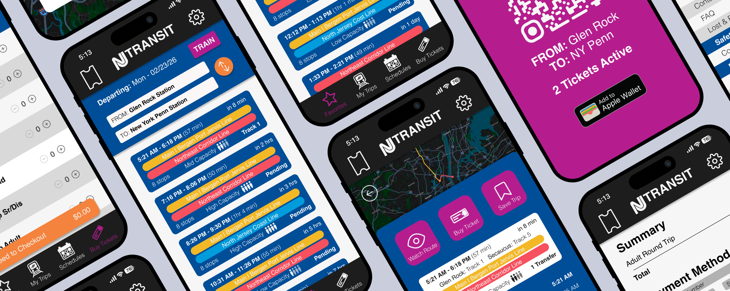
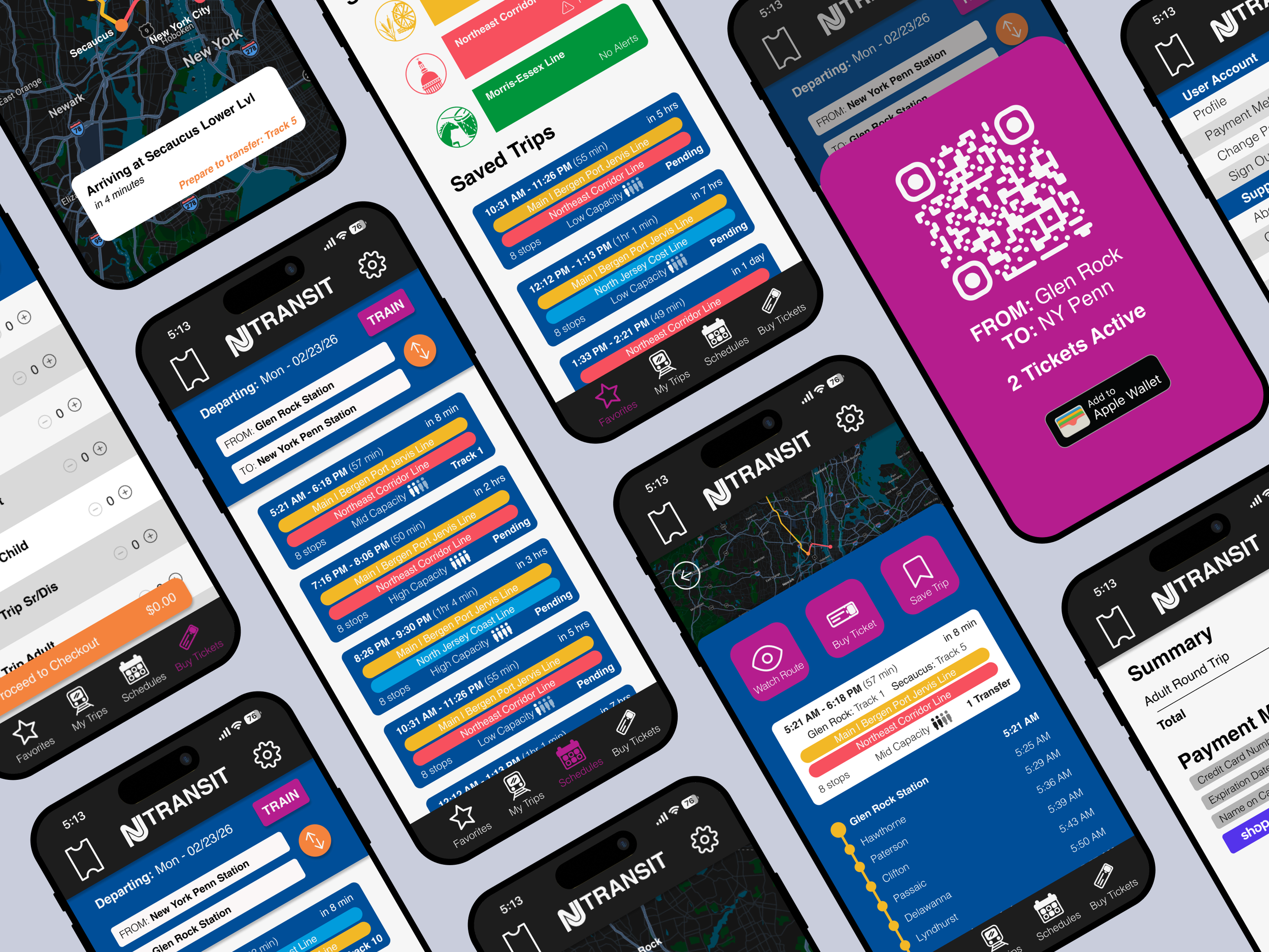
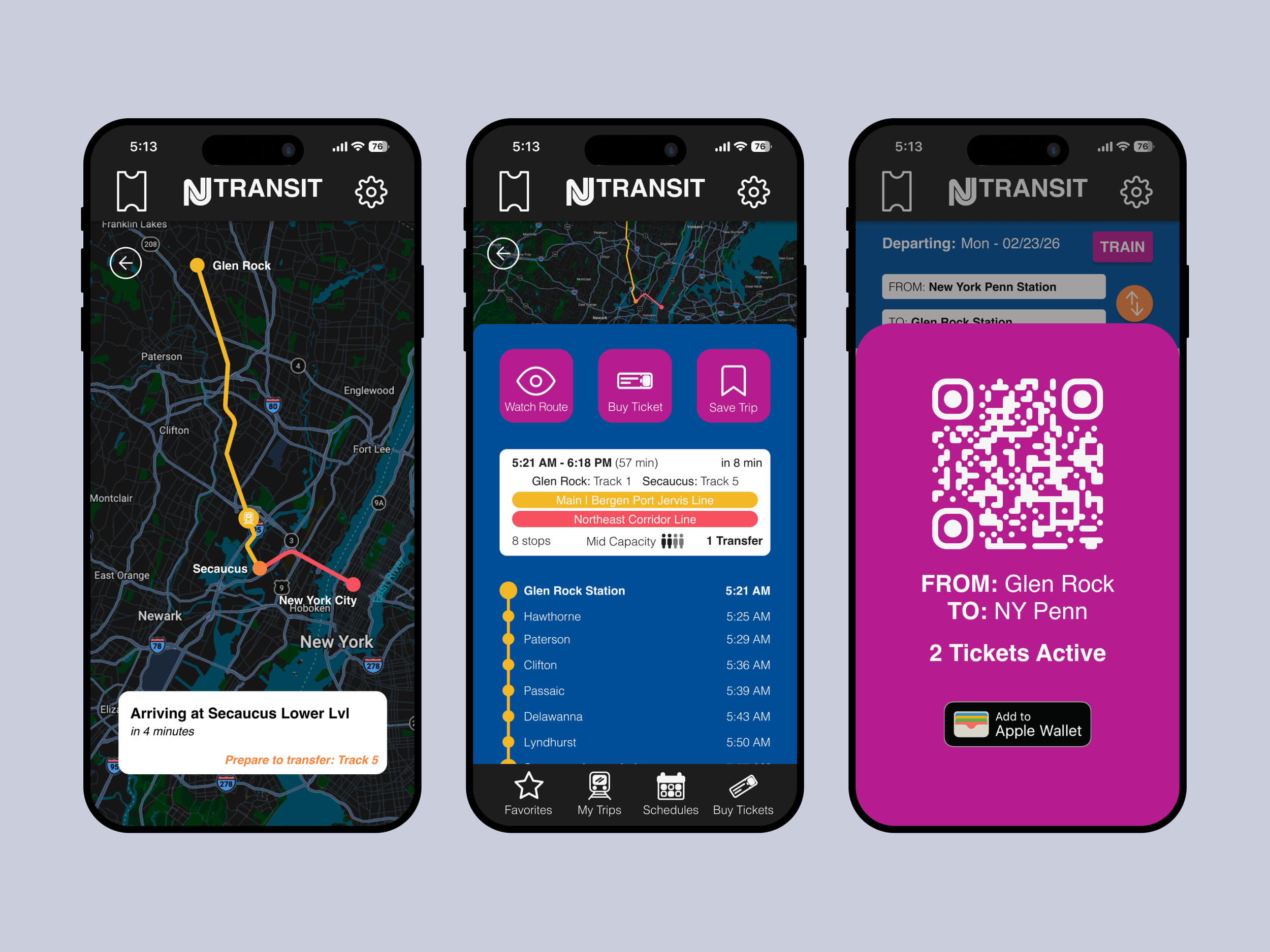
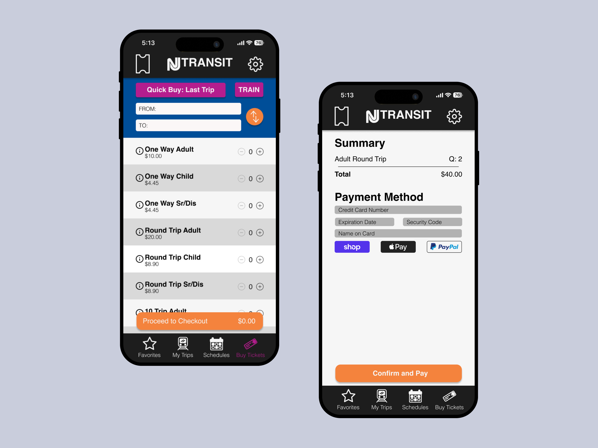
High Fidelity Prototype
Moving into my high fidelity prototype, I made sure to prioritize stronger utilization of the NJ Transit color palette for CTAs and buttons. The original app almost exclusively uses their blue, disregarding the pink and orange entirely. By strategically incorporating their full color palette I could improve visual distinctions between actions and strengthen call-to-action visibility. This helps create a more dynamic yet still brand-aligned interface.
I focused on adding more animations in my design to help provide the user feedback and create visual interest. These include button state changes, slide-in updates, and a slide-up activated ticket interaction. I also created a splash screen animation that plays, replacing that static image serves that purpose in the current app.
Reflecting
Redesigning the NJ Transit app allowed me to design based off of research rather than assumption. It pushed me to think of what a user may need in high stress situations and how those needs could be met as quickly as possible. I reduced the number of clicks to reach essential features, streamlining the app’s navigation by:
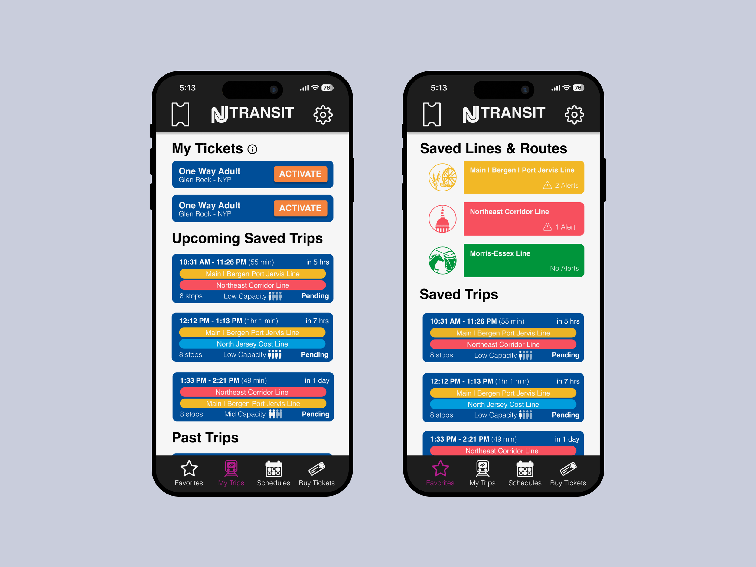
Having activated tickets accessible within one tap from anywhere in the app.
Enabling users to immediately input trip information upon launch, eliminating the need to navigate through 5–6 screens.
Adding “Save Trip” and “Watch Line” features to allow users to access information quickly instead of digging for information while actively traveling.
While this was a conceptual project, it reflects how I approach real-world UX challenges: starting with people, organizing complex interfaces, and designing with the user in mind. This project pushed me outside of my comfort zone and strengthened my ability to think critically about designing for a large-scale app with real-world application, resulting in work I am genuinely proud of.