
Hotel Operations Dashboard
Designing an operational dashboard to support the day-to-day management of hotel operations, while also providing insights to key metrics for informed, long-term decision-making.
Role
UI/UX Designer
Figma, Adobe Illustrator, Google Docs, Behance, Dribble.
Timeline
5 weeks (2025)
Project Type
Concept UI/UX Dashboard Design
Tools
Overview
Hotels rely on multiple systems to manage reservations, guests, rooms, and financial performance. Information is often fragmented across multiple platforms, making it difficult for staff to quickly access what they need.
This project focuses on designing an operational dashboard with strategic elements featuring a centralized interface that supports both time sensitive tasks and long-term decision-making. The goal was to create a system that allows different roles within a hotel to efficiently monitor performance, manage guests, and respond to issues as they arise.
The Problem
Hotel staff must manage large amounts of information across multiple areas, including reservations, guest services, room availability, and financial performance.
Key challenges include:
Difficulty accessing critical information quickly
Lack of a centralized system across departments
Challenges tracking performance metrics over time
Without a streamlined system, hotels are more prone to inefficiencies, missed details, and a lower quality guest experience.
The Objective:
To design a centralized dashboard that allows hotel staff to efficiently manage daily operations while also providing clear access to key performance data. My goals included centralizing essential information, supporting both operational tasks and performance insights, and improving visibility into real-time hotel activity.

Empathize
Understanding users through research to uncover needs and pain points.

Define
Turning insights into clear problems and focused direction.

Ideate
Brainstorming and exploring potential design solutions.

Prototype
Creating tangible designs and testable ideas.
Testing
Gathering feedback and refining for usability.
Visual Research
I began by analyzing existing dashboards to understand common patterns in data visualization and layout. My key takeaways included the importance of clear hierarchy and modular layouts, the need to group data by function (operations vs. analytics), and that navigation should allow quick switching between sections. This research informed both the structure and visual direction of the dashboard.
Information Architecture
I structured the dashboard into distinct sections based on user needs:
Overview: Quick access to frequently used operations and insights
Guests/Reservations: Guest data, demographics, booking details, check-ins, cancellations
Rooms: Availability, room status and maintenance,
Finance Revenue and performance trends
This structure ensures that users can quickly navigate to the information most relevant to their role.
Sketching
Low-fidelity sketches helped me explore layout options and prioritize information. I focused on clear hierarchy, logically grouping data, and balancing density with readability. This stage allowed for rapid iteration before moving into digital design.
User Persona 1
Gina: General Manager
Needs a high-level overview of performance across departments
Wants centralized data to monitor growth
Struggles with tracking metrics across multiple platforms
Needs quick access to insights
This persona helped ensure the dashboard supported both managerial oversight as well as operational efficiency.
User Persona 2
Frank: Front Office Manager
Focused on daily operations and guest experience
Needs real-time visibility into bookings and guest needs
Struggles to track complaints and service requests
Requires quick, actionable information
This persona helped ensure the dashboard supported operational efficiency and everyday, time-sensitive hotel needs.
Wireframes
I developed wireframes to define structure and layout more precisely. In this stage I focused on laying out the UI for the sidebar navigation, dashboard widgets, data tables for reservations and guest lists, and overlay cards for a more in-depth view. This stage allowed me to focus on information layout rather than aesthetics.
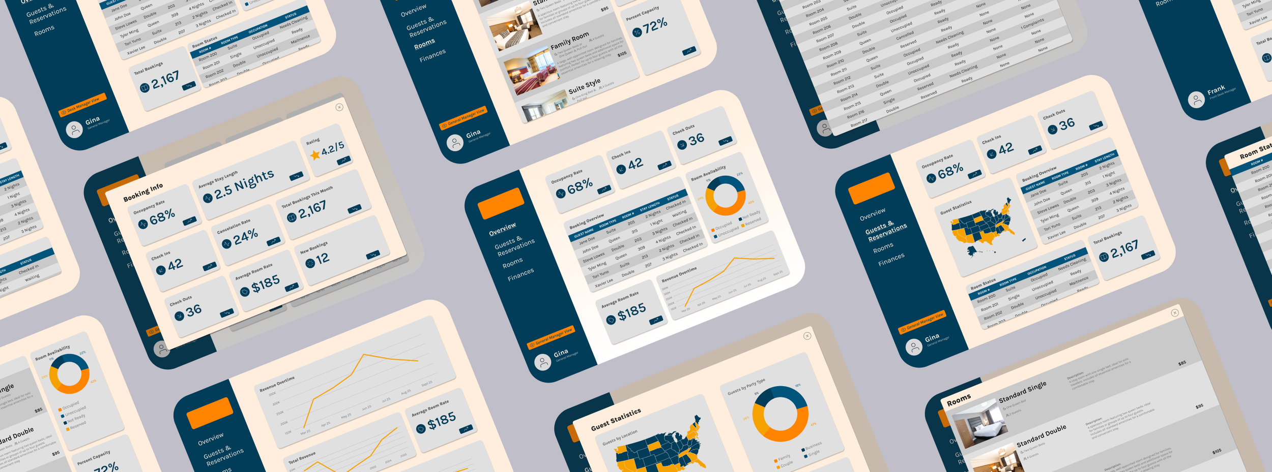
High Fidelity Prototype
In the final design, I refined the interface to improve visual clarity and usability as well as introduced prototyping to enhance the design and navigation.
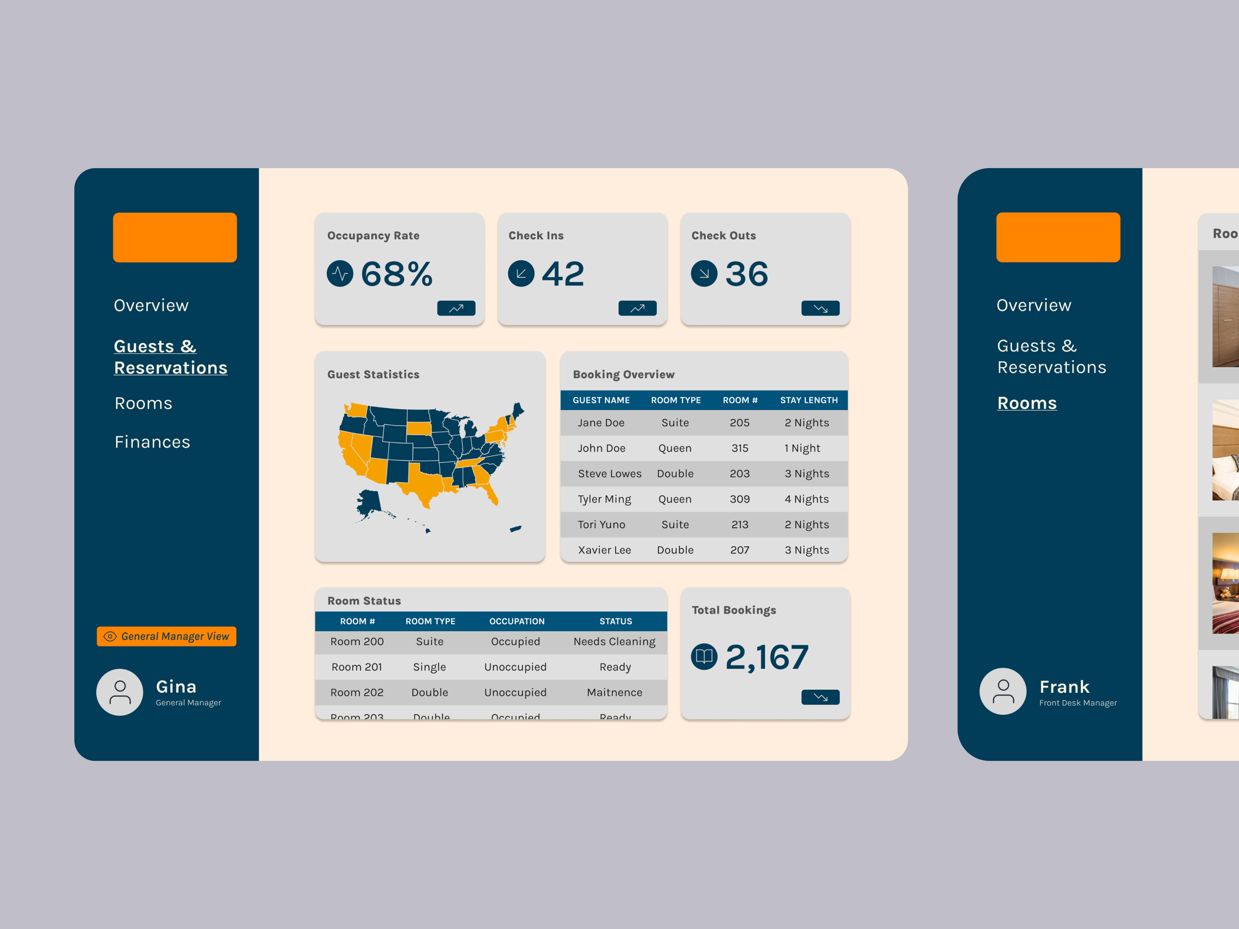
Overview Dashboard:
Total bookings, new bookings, check-ins, check-outs
Revenue overview and trends (for the General Manager View)
Room availability snapshot
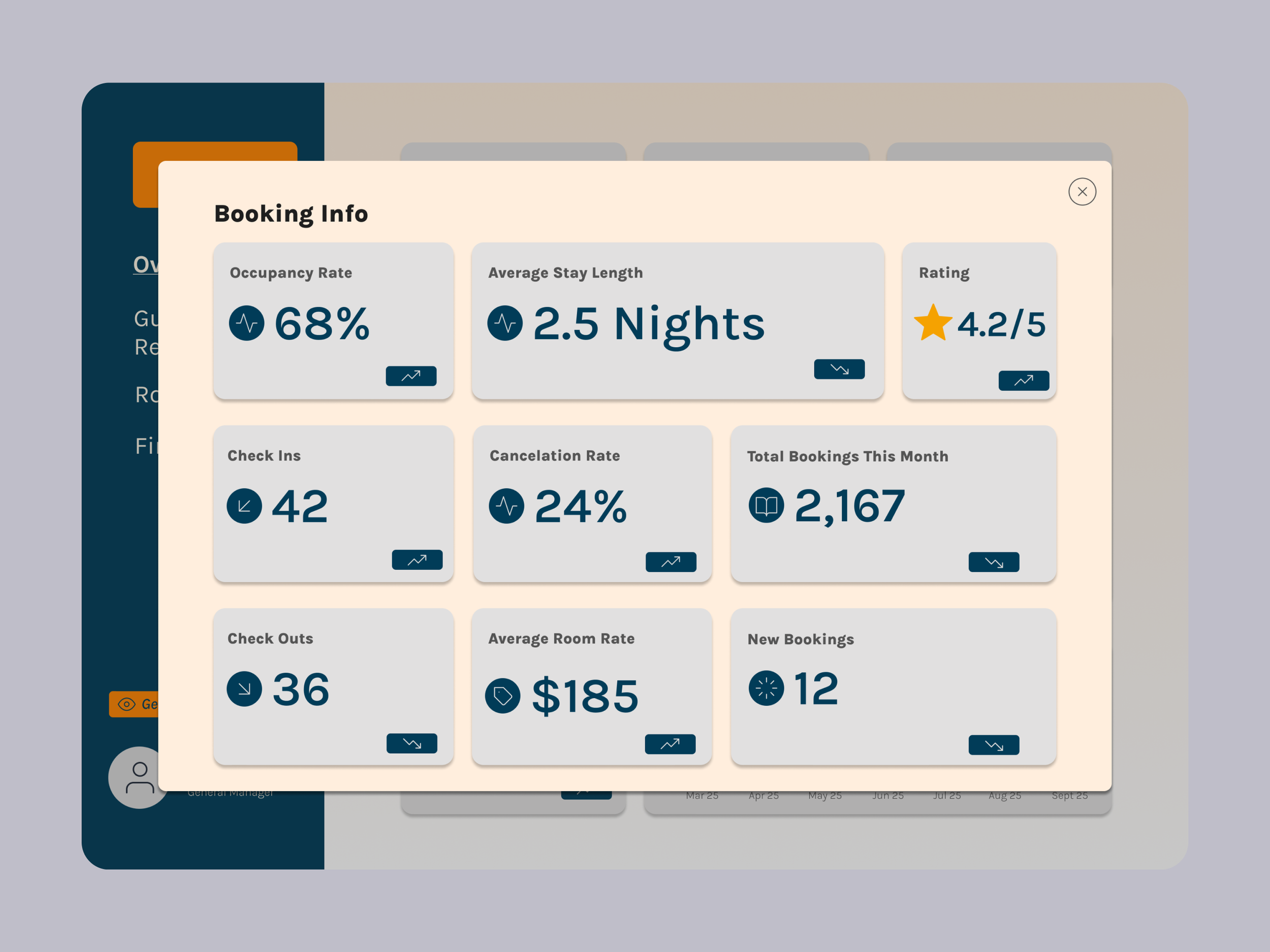
Guests/Reservations Section:
Cancellation rate and average stay length
Check-in/check-out tracking
Booking list and detailed stay information
Guest demographics and booking behavior
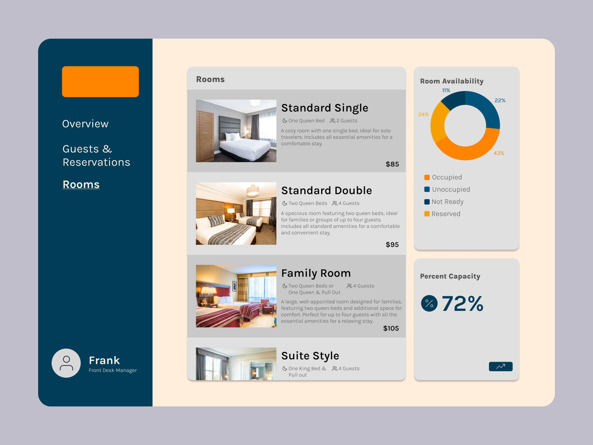
Rooms:
Room-by-room availability
Maintenance flags and reported issues
Availability by room type
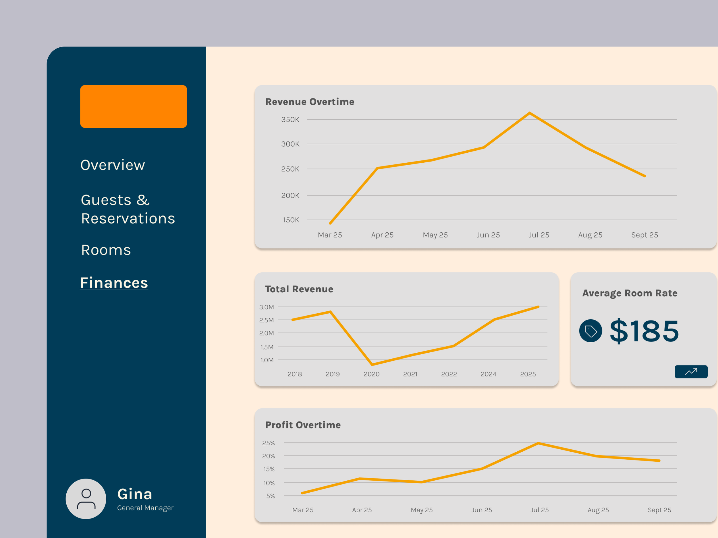
Finance (Available in the Manager View Only):
Revenue and profit tracking
Performance over time (daily, monthly, yearly)
Average room rate and booking sources
Reflecting
This project strengthened my ability to design for complex systems and data-heavy interfaces.
By working through user needs, information architecture, and iterative design, I learned how to:
Simplify large amounts of information into clear, usable interfaces
Design for multiple user types with different goals
Balance operational functionality with strategic insights
Prioritize clarity and usability in data visualization
This project reinforced the importance of structure in design, showing that a strong foundation is just as critical as visual design in creating effective user experiences. This project reflects my approach to UX design: understanding user needs, organizing complexity, and designing interfaces that support both efficiency and decision-making.