
Quinnipiac Tonight Social Media, Graphics & Branding
Leading the social media presence and visual identity for Season 11 of Quinnipiac Tonight, content creation, including brand development, motion graphics, photography, and a full logo redesign.
Role
Social Media Manager, Motion Designer, Brand Designer, Photographer, Photo Editor
Adobe Illustrator, Photoshop, Google Docs, Behance, Dribble.
Timeline
1 year (2024-2025)
Collaboration
Quinnipiac Tonight Season 11 Leadership Team
Tools
Overview
Quinnipiac Tonight is an SNL-inspired, student-run comedy show at Quinnipiac University. Each season features a new cast, hosts, segments, and direction, making branding and promotion essential for drawing a crowd. With the new season, there was an opportunity to rethink how the show presented itself visually, both with social media presence and within the show itself.
This project focused on creating a more cohesive and recognizable identity while supporting the fast-paced, entertainment-driven nature of the show.
The Problem
Prior to Season 11, Quinnipiac Tonight lacked a consistent and unified visual identity.
Key issues included:
Inconsistent branding across social media posts
Lack of a clear visual system for recurring content
An outdated logo that no longer reflected the energy of the show
No distinct identity for new segments, specifically The Jeff & Madison Show
Without a cohesive system, content felt disconnected and less recognizable to viewers.
The Objective:
To establish a cohesive and engaging visual identity for Quinnipiac Tonight that supports both the show’s personality and its promotional needs. My goals included creating a consistent and recognizable social media presence, updating the show’s branding, developing templates for recurring content, and increasing audience engagement.
Updated Brand Identity
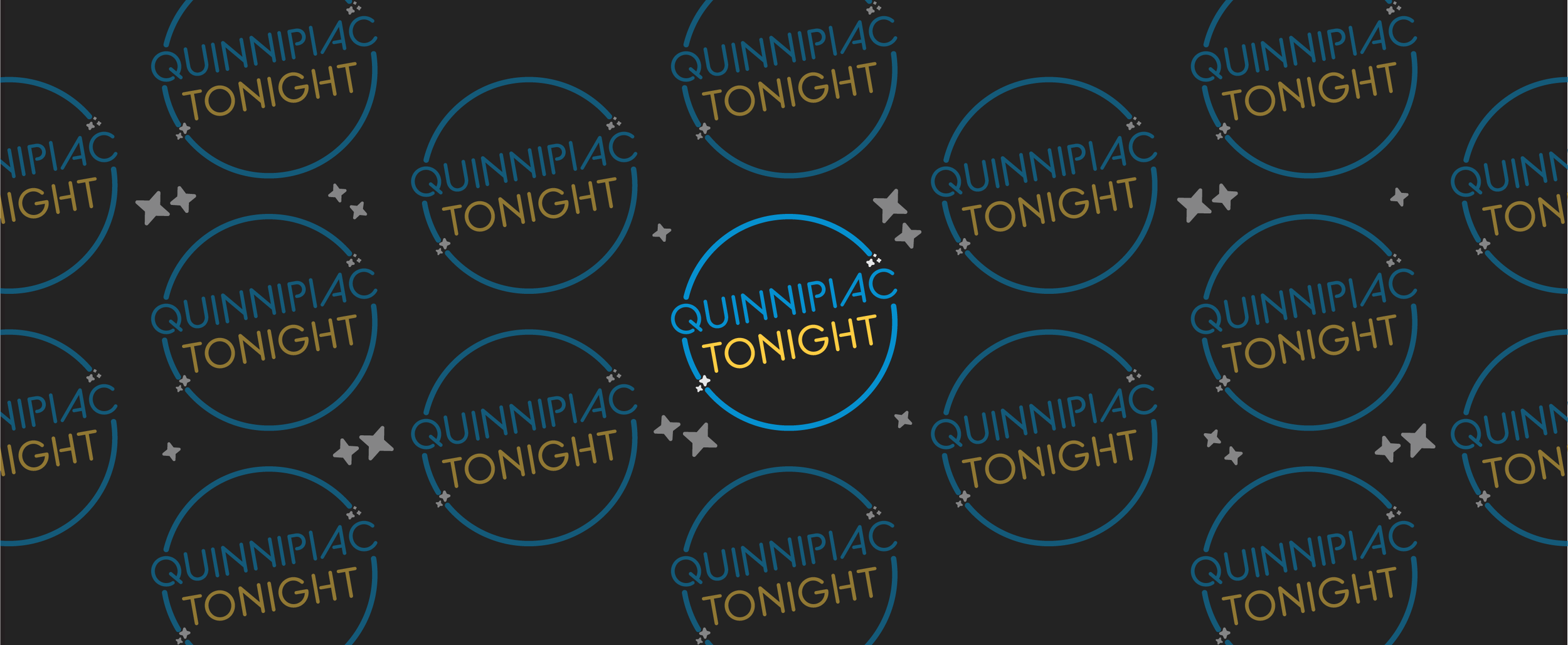
For the first time in over 10 years, I redesigned the Quinnipiac Tonight brand identity, a more modern and dynamic look and better alignment with the tone of a late-night comedy show.
For the visual identity I wanted to lean into the “tonight” in Quinnipiac Tonight with a starry sky aesthetic. Molding dark and light blues and a deep golden yellow helped portray this look. Later in the season this was changed to a bright and vibrant blue and yellow to reflect the more modern and exciting look we were aiming for.
For the typeface we liked the direction of “Clip” as it resembled a neon sign. We chose “BC Alphapipe,” a modern typeface with gaps in some glyph variations that pay homage to the original typeface.
The old logo featured glows that felt outdated. We removed those, opting for the bright blue and yellow instead. We kept the angle of the text but instead of forcing “Quinnipiac” to fit awkwardly in the circle we let it break the barrier. Adding the stars spiced up the outer circle while bringing in the late-night theme.
**Note: The new logo and current brand identity was established and implemented at the midway point of the season, accounting for variations in color and direction.
Planning
Before creating any content, I focused on establishing a clear direction for the season’s visual identity. This included identifying key content types (cast/leadership announcements, host reveals, etc.), creating a brand board for posts, and creating a posting schedule.
Social Graphics
I developed a system of social graphics templates to support recurring content, including:
Meet the Cast / Meet the Leadership Team posts
Host announcements (Show promotion)
Cast Audition Information
Each graphic followed a layout and style consistent to the branding, making posts recognizable while still allowing flexibility for different content.
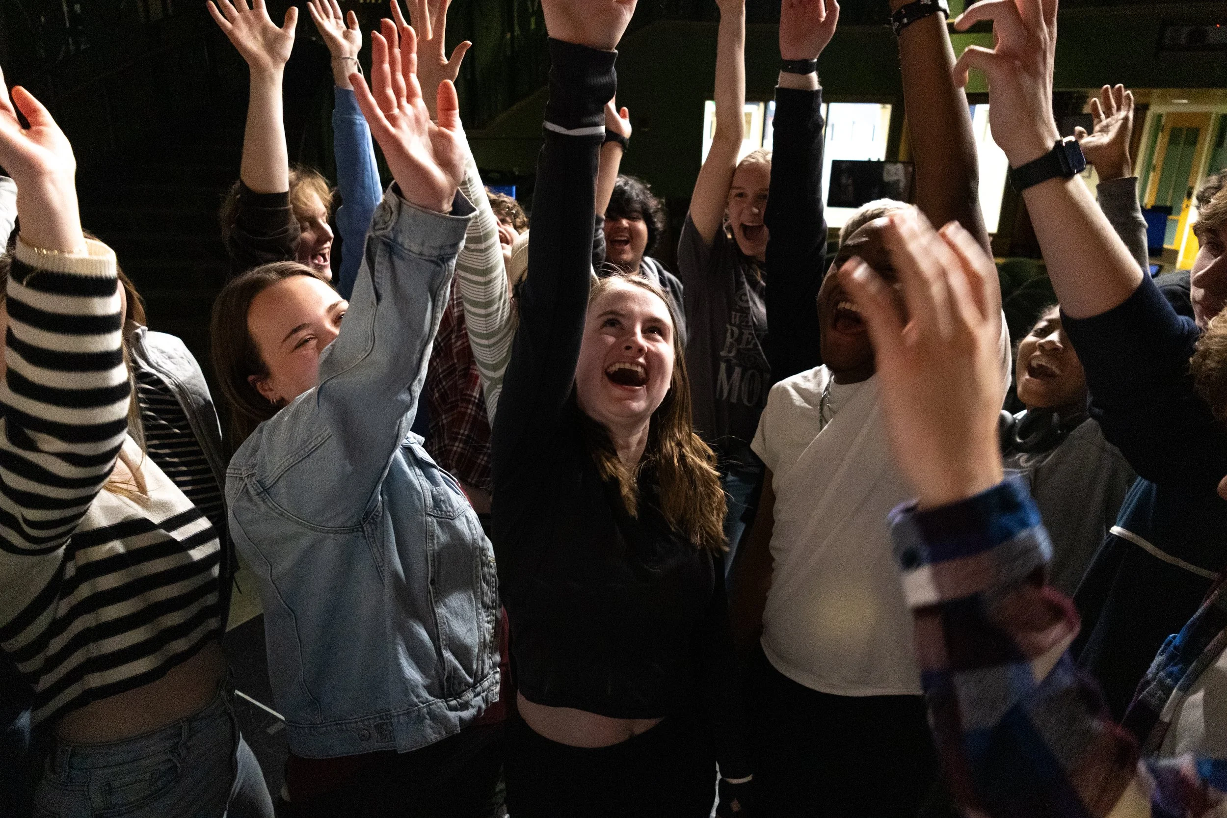
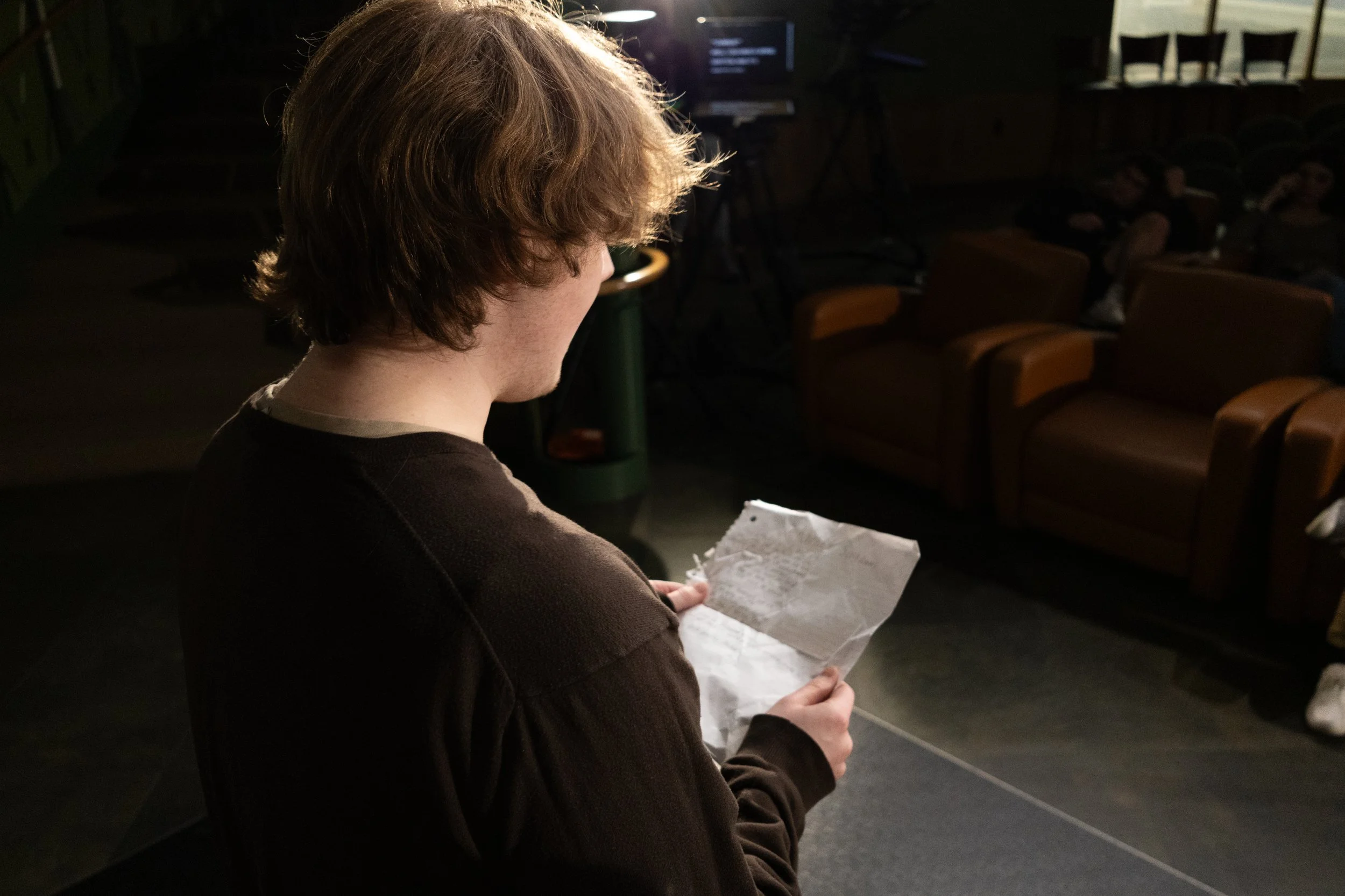
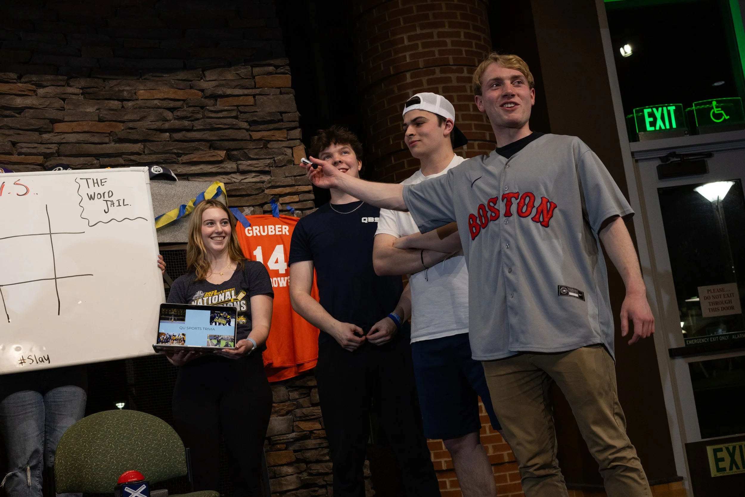
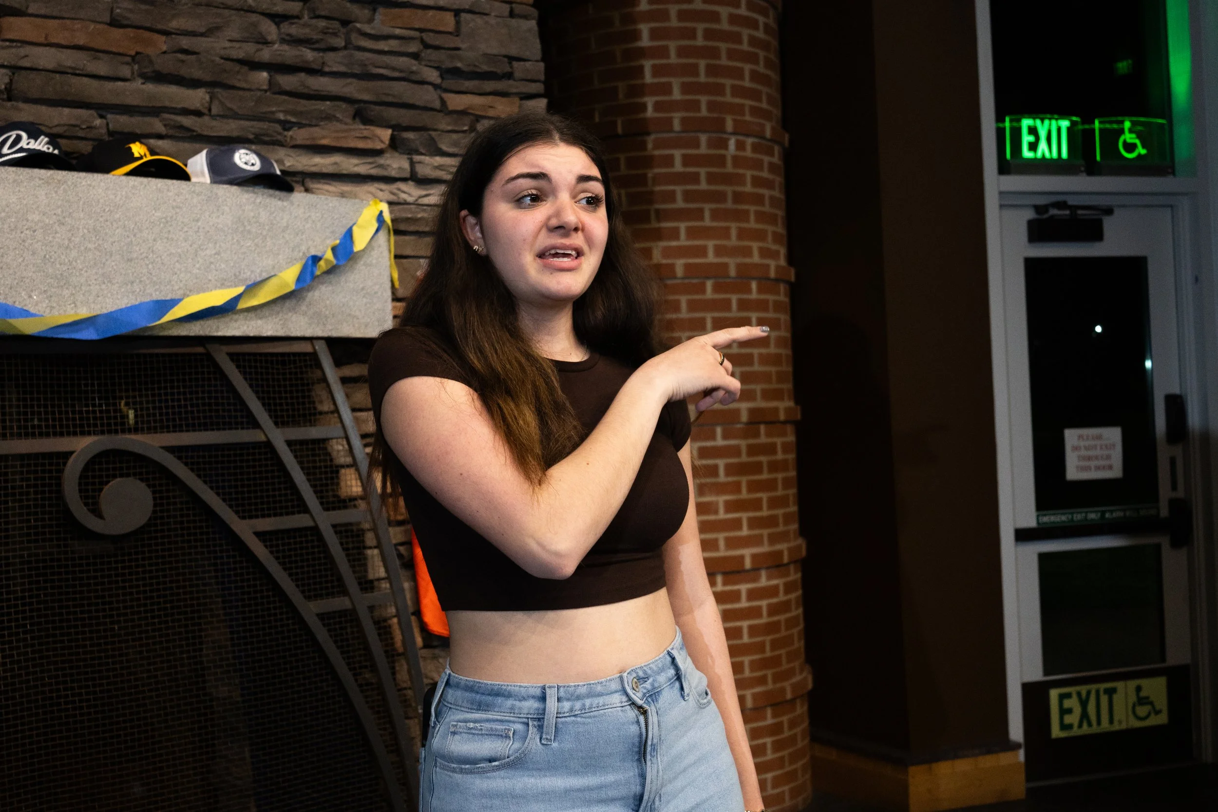
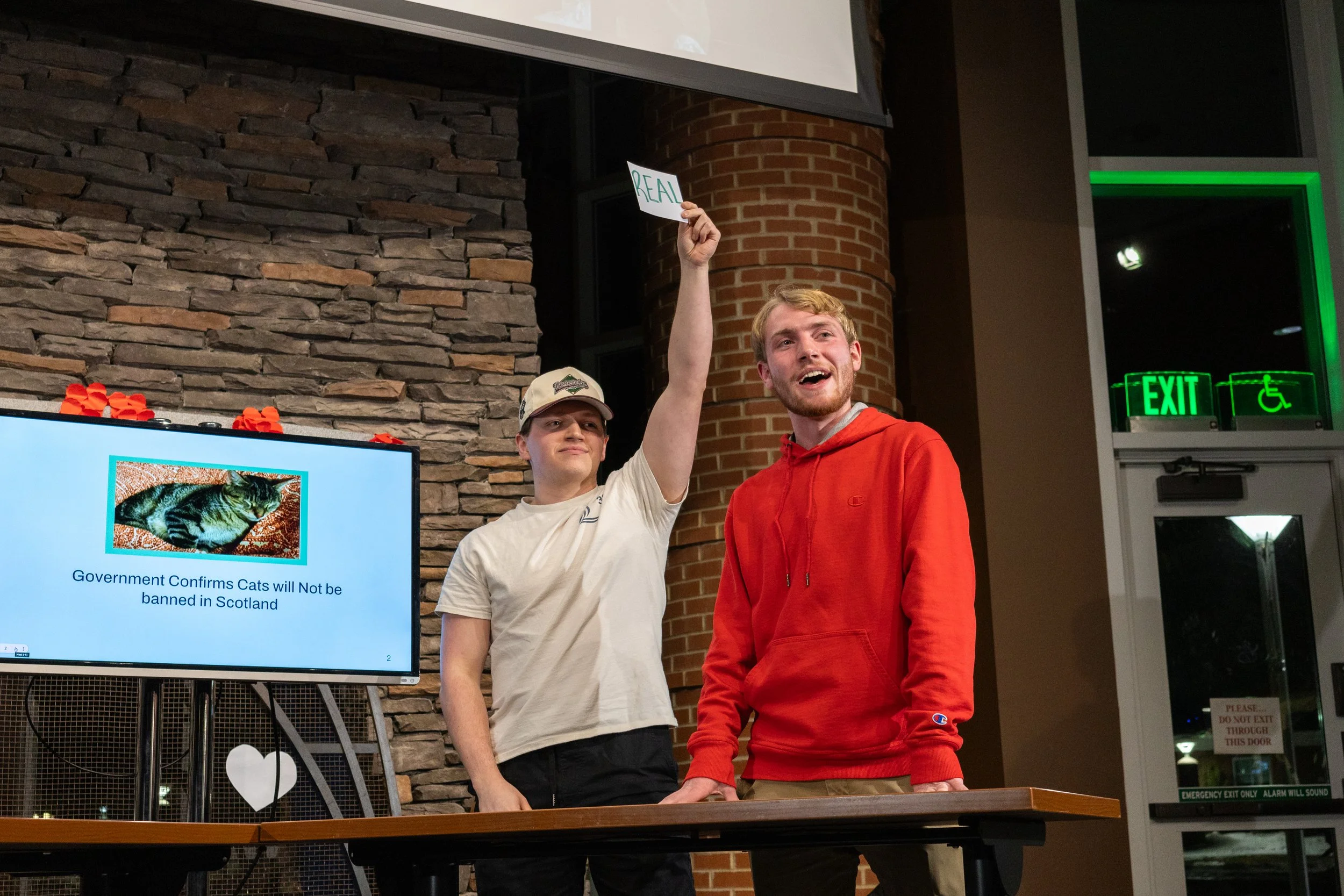
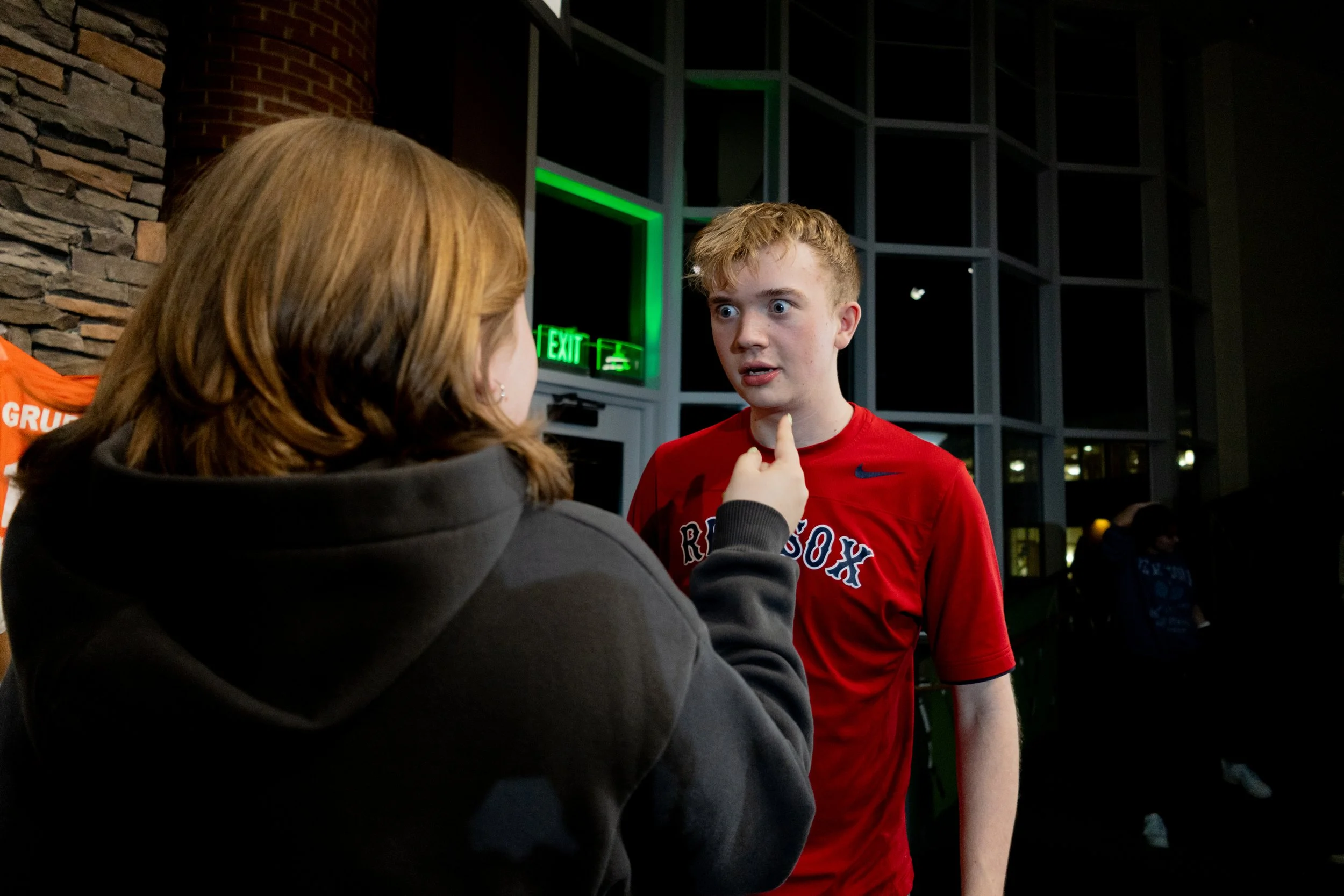
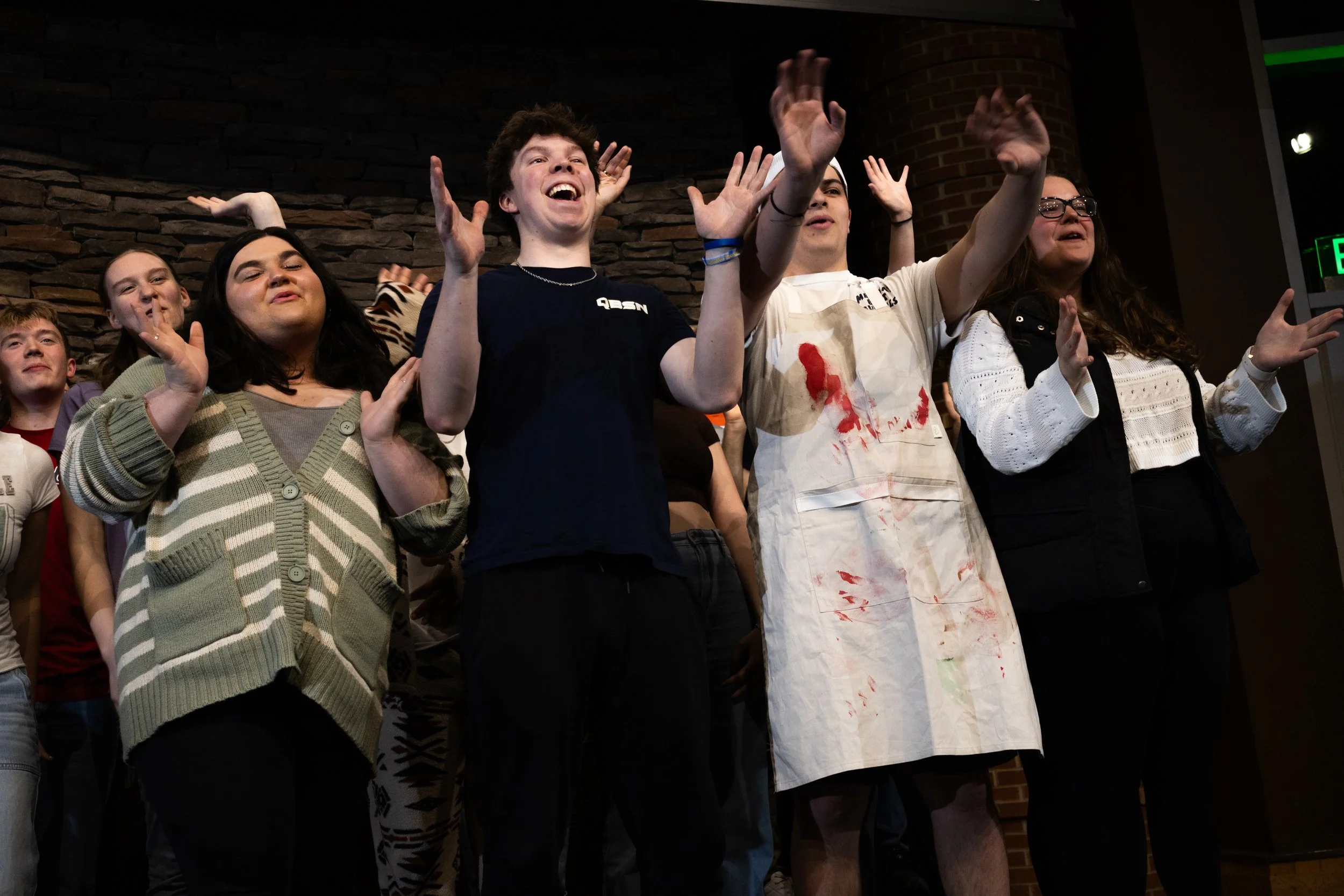
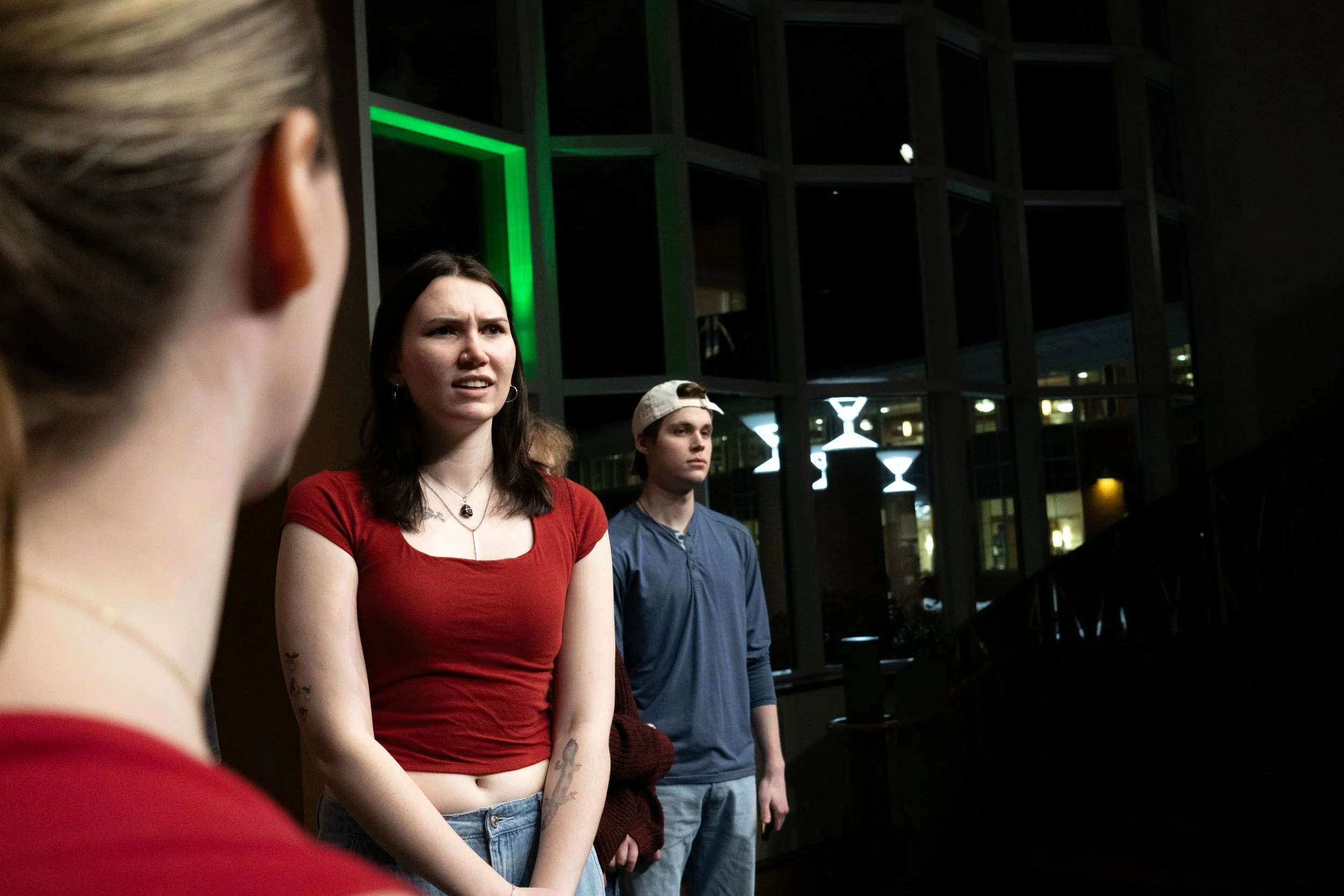
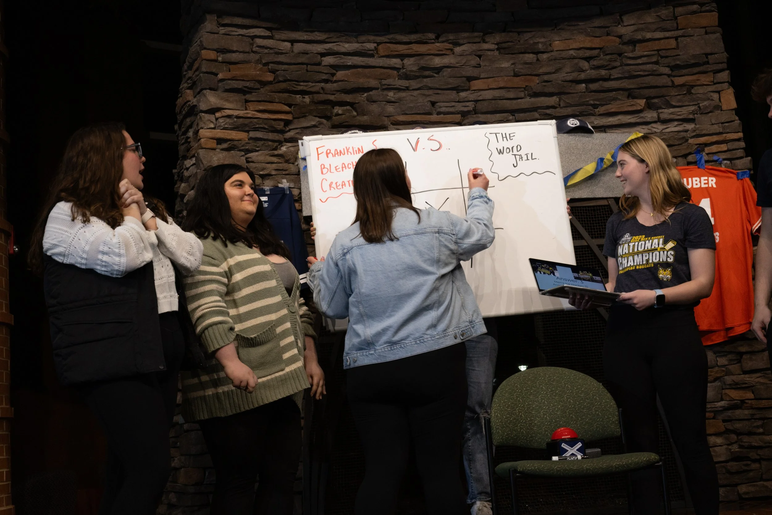
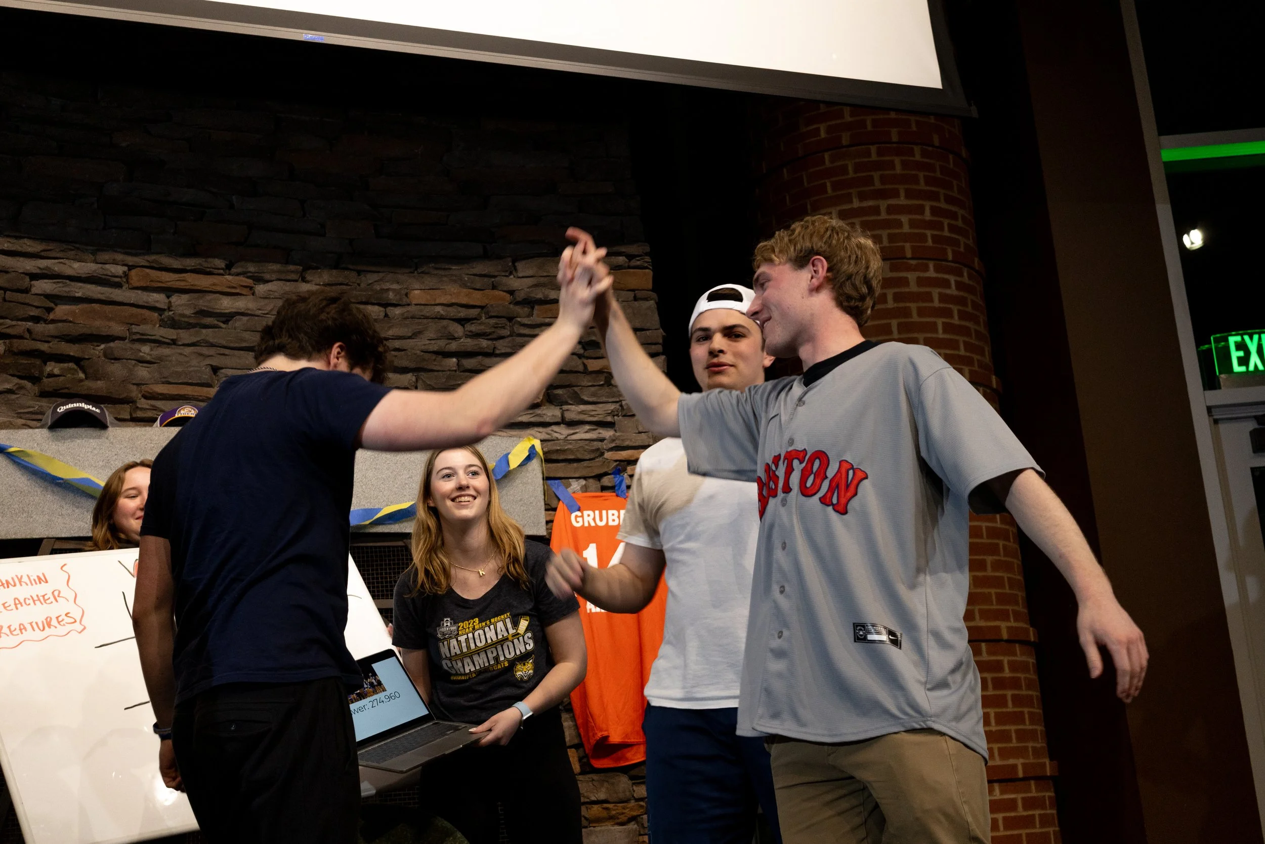
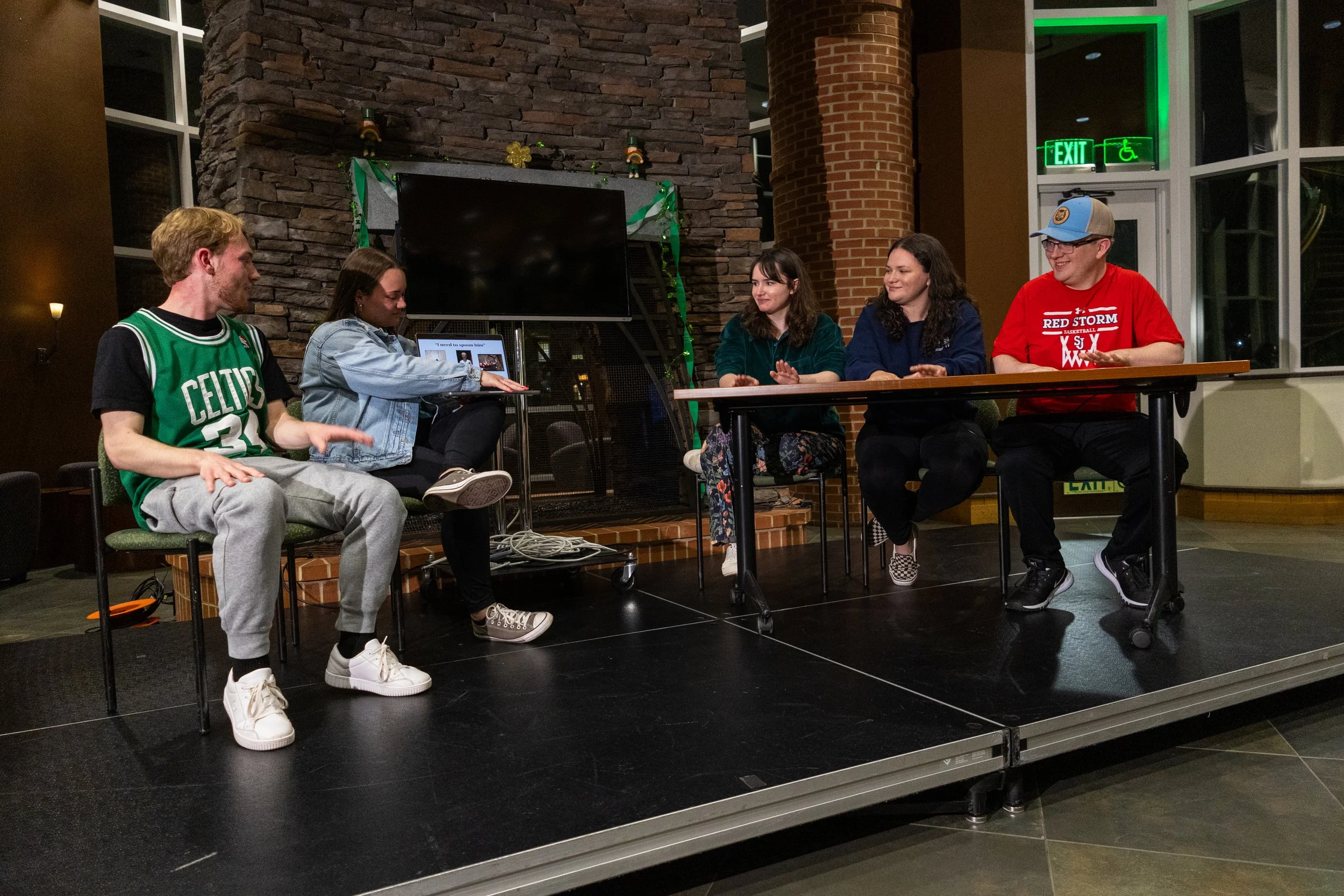
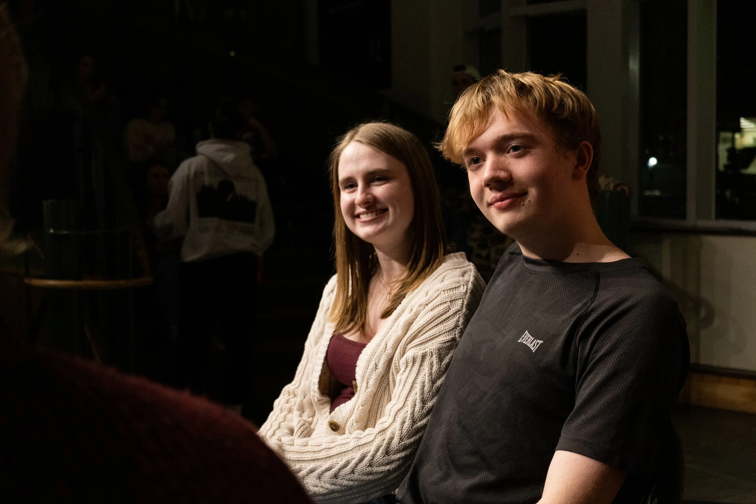
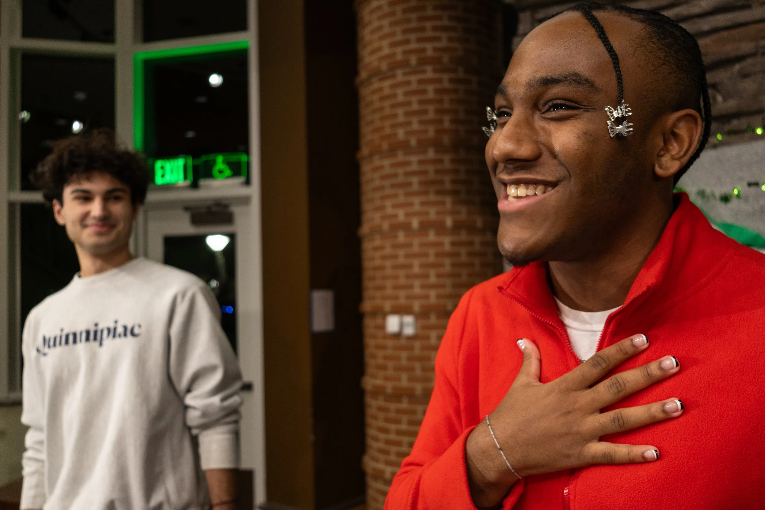
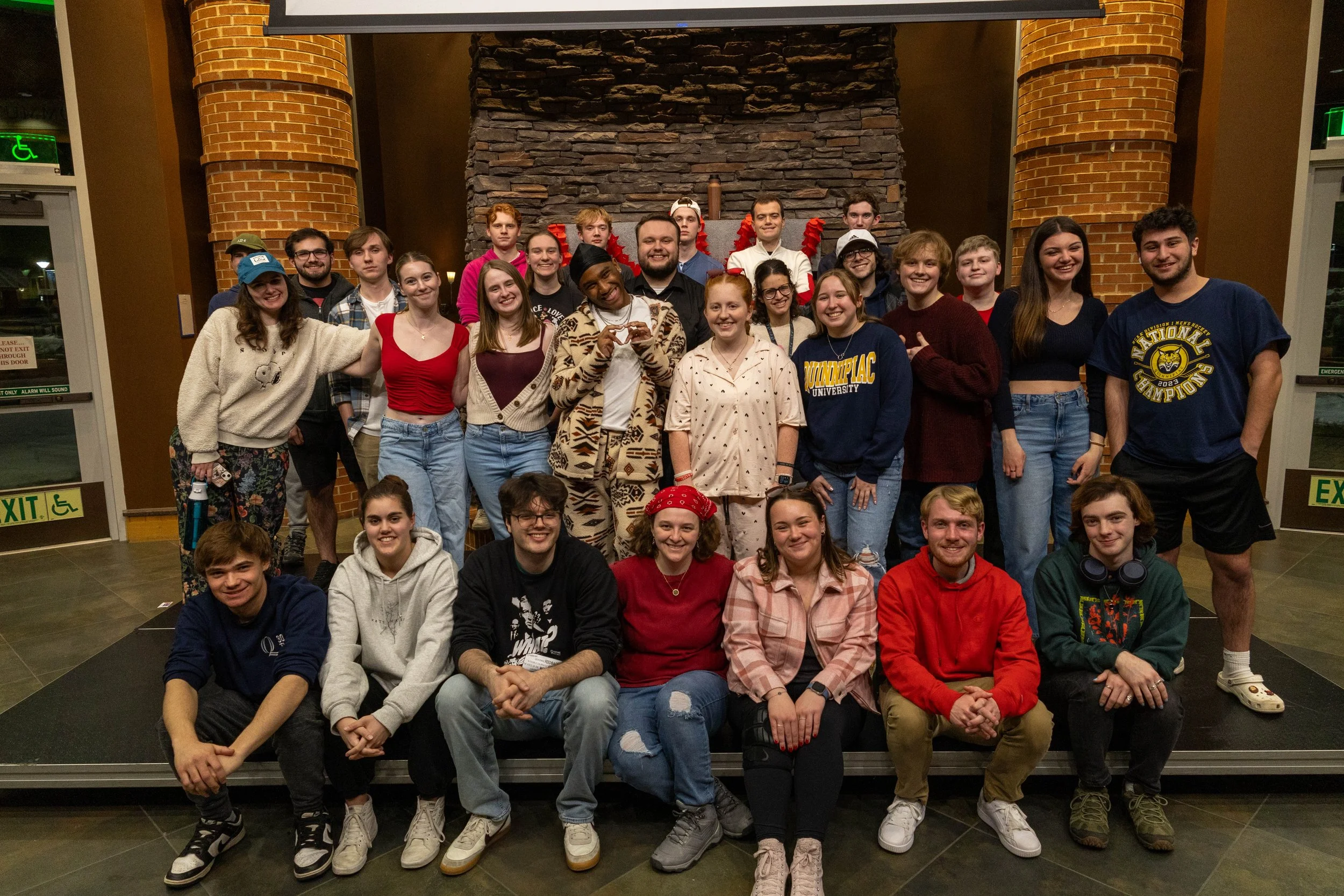
Photography
Photography played a key role in capturing the show.
I was responsible for:
Documenting live shows and behind-the-scenes moments
Taking promotional photos of hosts
Editing images for use across social media
These visuals helped create a more authentic and engaging presence online.
Title Graphics
To support the show’s video content, I created graphics that were used as title cards and segment introductions for the show’s prerecorded content. Created primarily in After Effects, these cards helped elevate and introduce segments to our audience. The motion design energy and added production value to the show.
Jeff & Madison Show
A new live segment, The Jeff & Madison Show, featuring weekly games with our hosts required its own distinct identity reflecting the personalities of our writers (Jeff and Madison). I developed a unique logo, title graphic, and visual style that differentiated the segment. It allowed the segment to stand on its own while still feeling as thoughtful as the larger show.
For the color scheme we stuck with a vibrant pink and dark blue, connecting letterforms for their logo, and fun photos for their introduction graphic to convey Jeff and Madison’s different yet playful personalities and team dynamic.
Reflecting
Working on Quinnipiac Tonight allowed me to design within a fast-paced, content-driven environment where consistency and adaptability were equally important.
Through this project, I learned how to:
Build a cohesive brand system
Design templates that support recurrent social media posting
Adapt a brand when its needs change
Work across multiple mediums, including static posts, motion graphics, video content and photography
The introduction of a new visual system made content more recognizable and professional, helping strengthen the show’s overall presence. This experience also pushed me to think about branding as something that’s living, not just as a one-time creation, but as something that evolves across platforms, formats, and time.