
Burpee Seed Packet Redesign
A packaging redesign project for Burpee seed packets, focusing on updating an outdated design and elevating their shelf presence.
Role
Packaging Designer
Adobe Illustrator, Pinterest, Photoshop, Behance, Dribble.
Timeline
5 weeks (2025)
Project Type
Concept Packaging Redesign
Tools
Overview
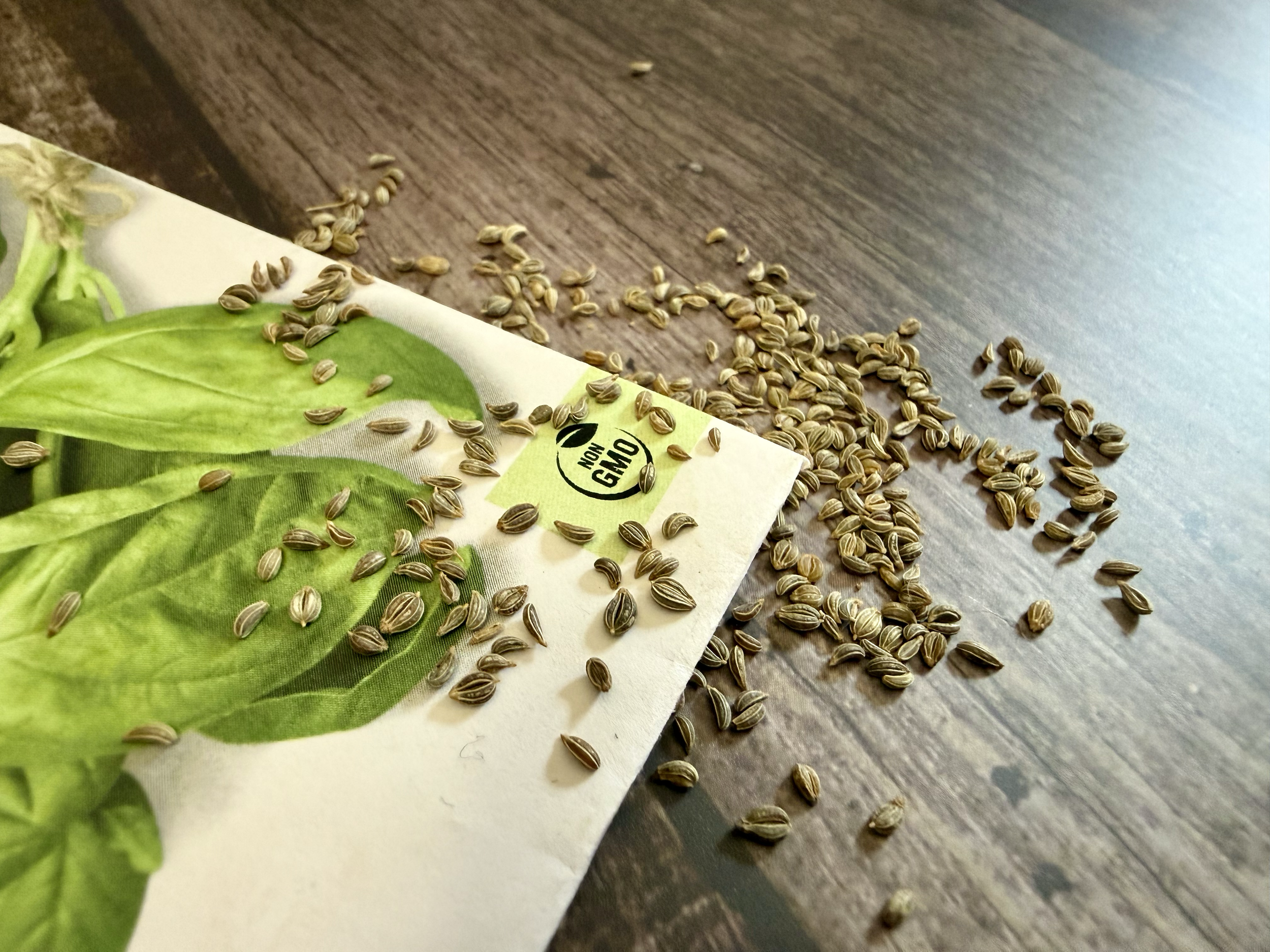
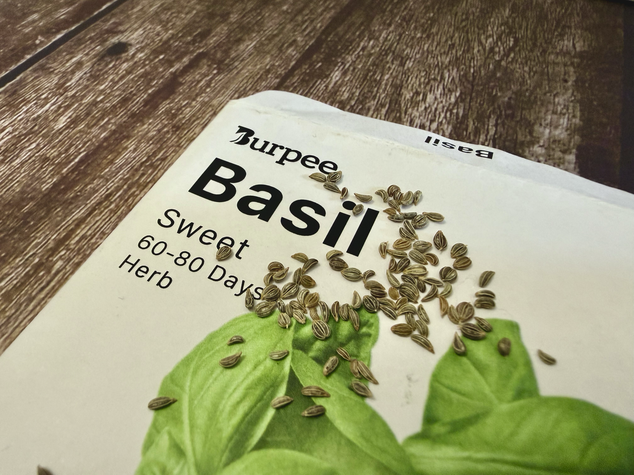
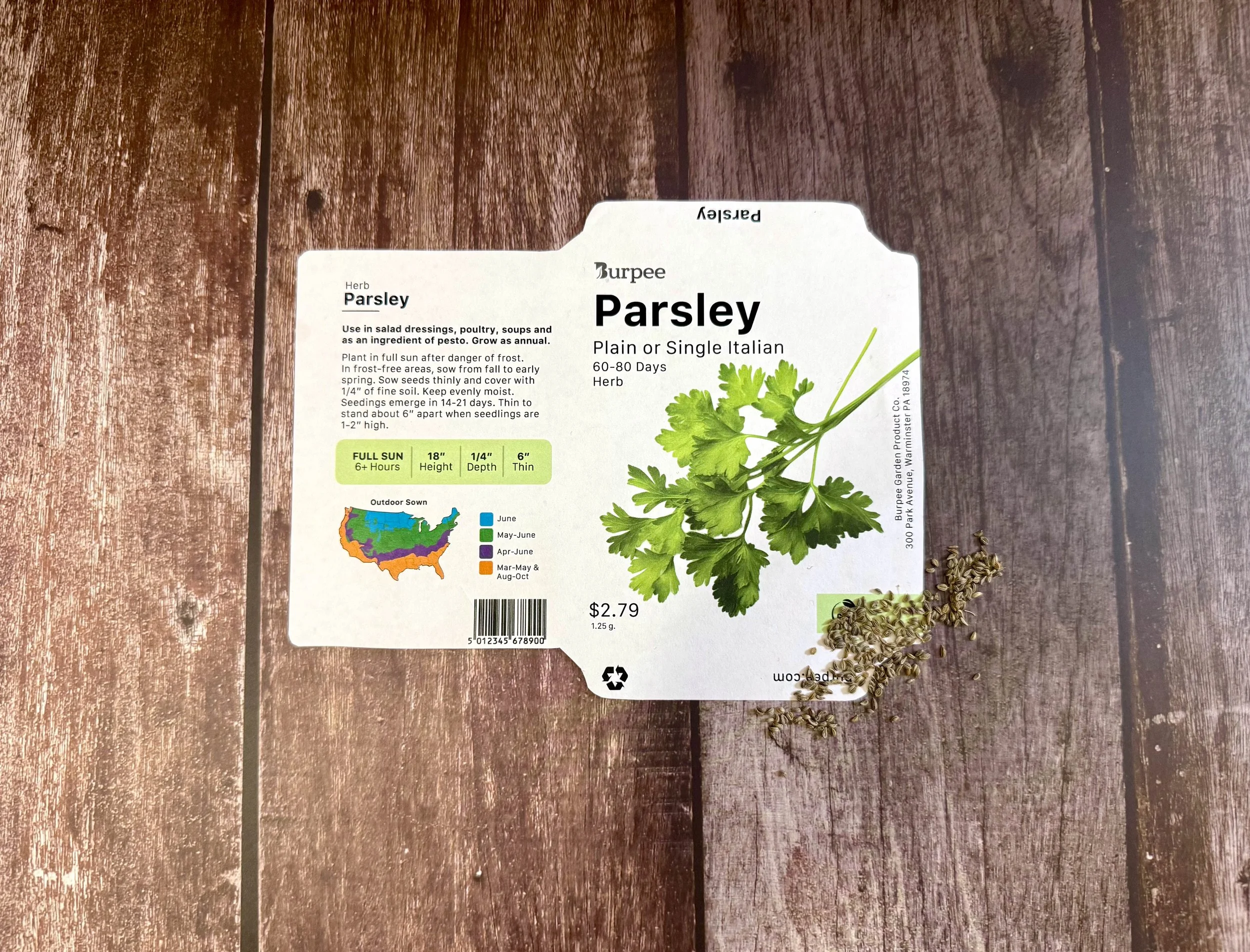
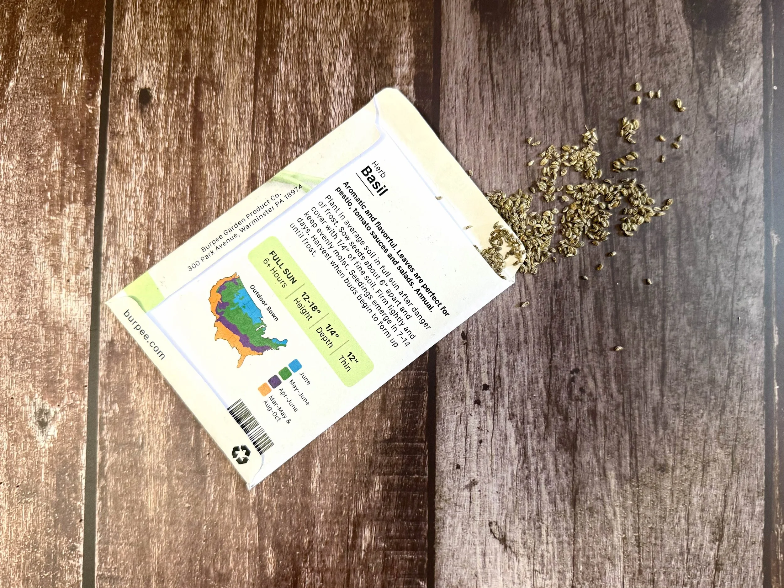
Burpee is one of the most well known names in home gardening, known for providing seeds and growing resources to gardeners of all experience levels. Their seed packets are widely distributed everywhere from garden supply to grocery stores. This touchpoint often serves as a customer’s first interaction with the brand.
While the brand itself is well-established, the current seed packet designs feel visually outdated. In a market where brands are embracing cleaner, bolder, and more modern packaging systems, Burpee’s packets risk blending into the background.
This project explores how a refreshed packaging system could elevate the brand while improving usability and shelf presence.
The Problem
Burpee’s existing packaging feels dated. It lacks the ability to stand out on a shelf. Their use of drop shadows and generic imaging make it struggle to stand out in a competitive retail environment. The brand feels less approachable, especially to younger demographics, and makes the browsing experience more visually strenuous than necessary.
The Objective:
My goal was to redesign Burpee’s seed packets to feel more modern and visually engaging. I wanted to accomplish this by updating the visual system to a cleaner, more modern layout, maintaining a consistent structure across all seed packets, and improving shelf presence through stronger visual impact.
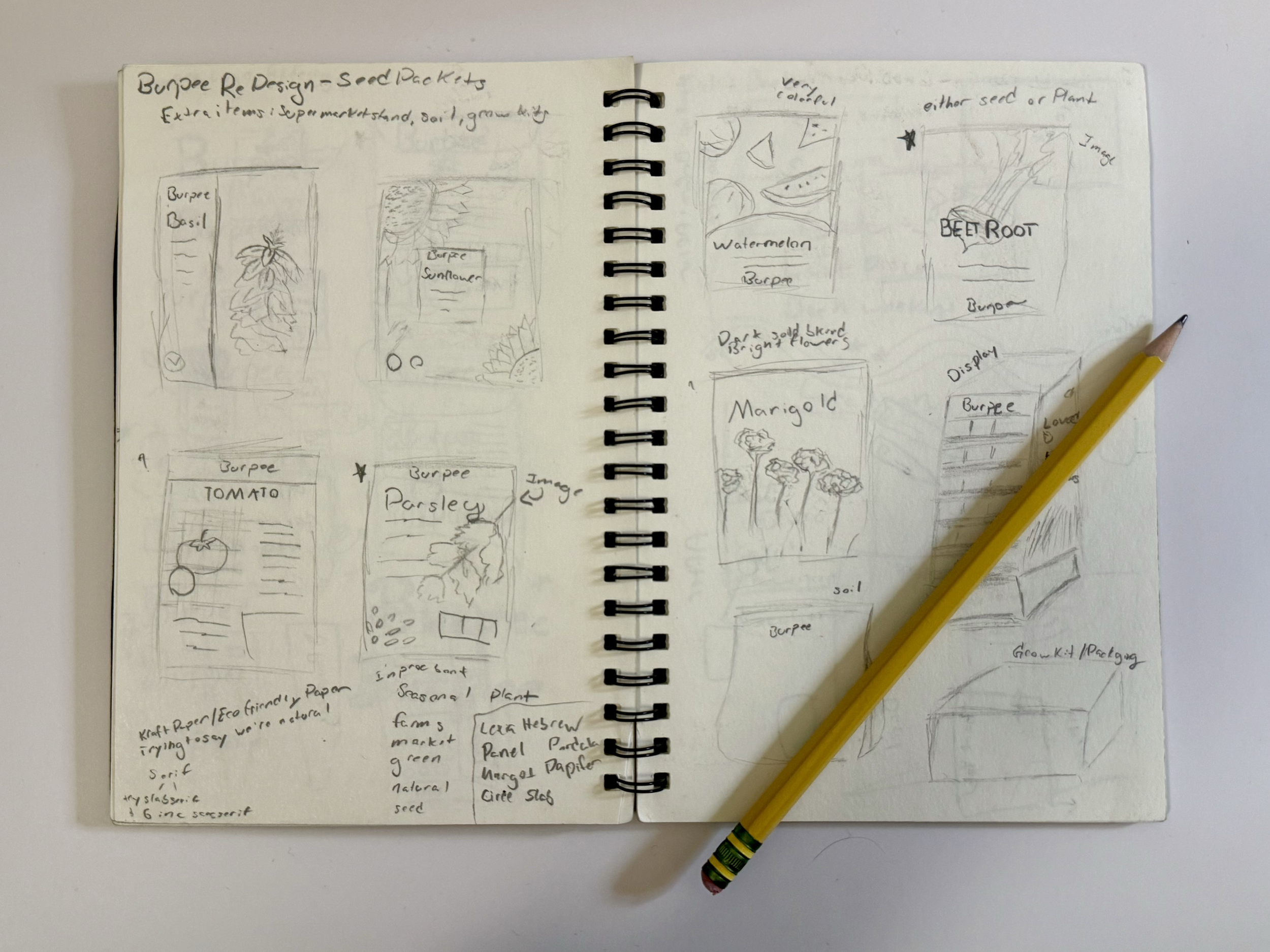
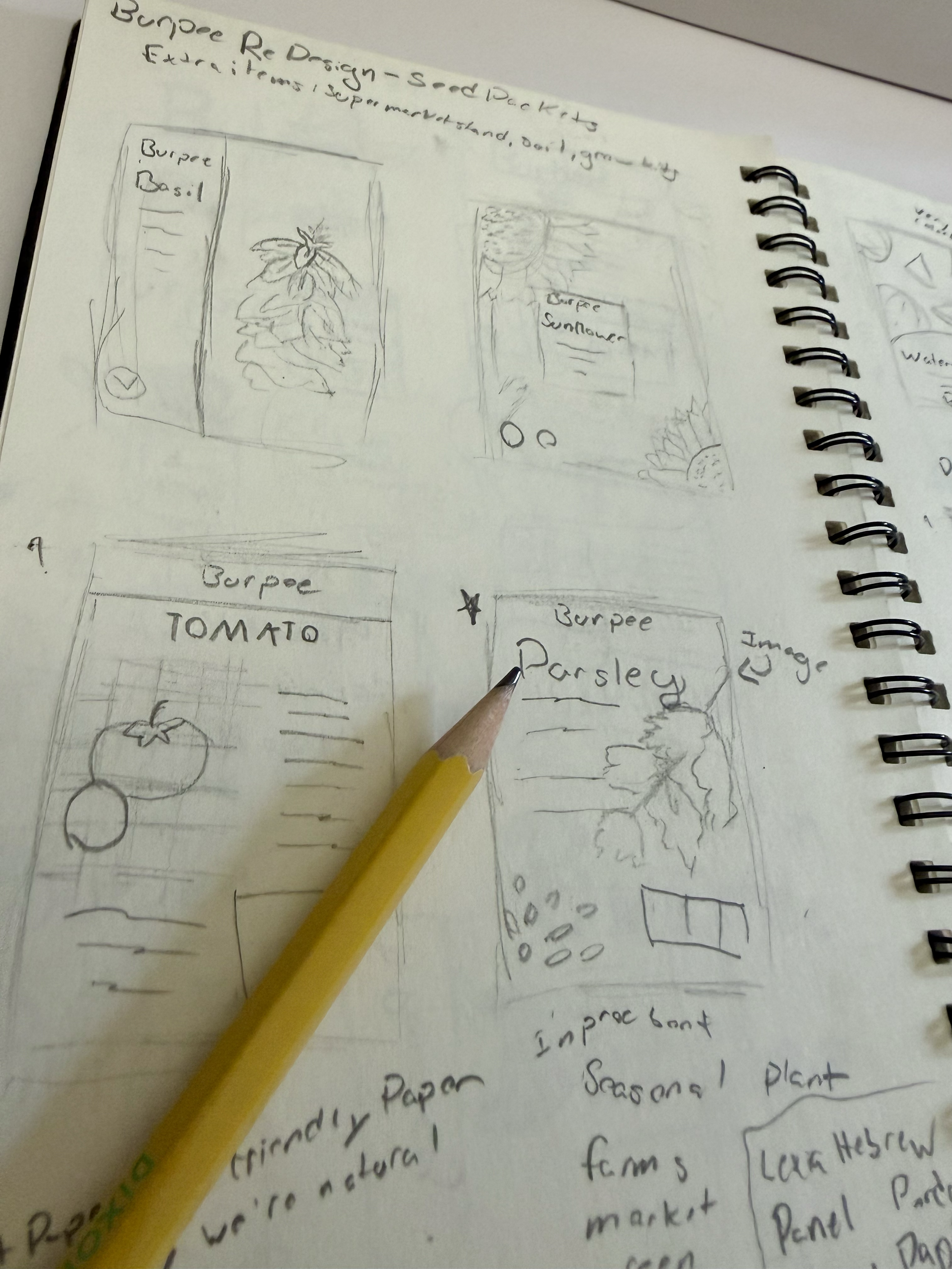
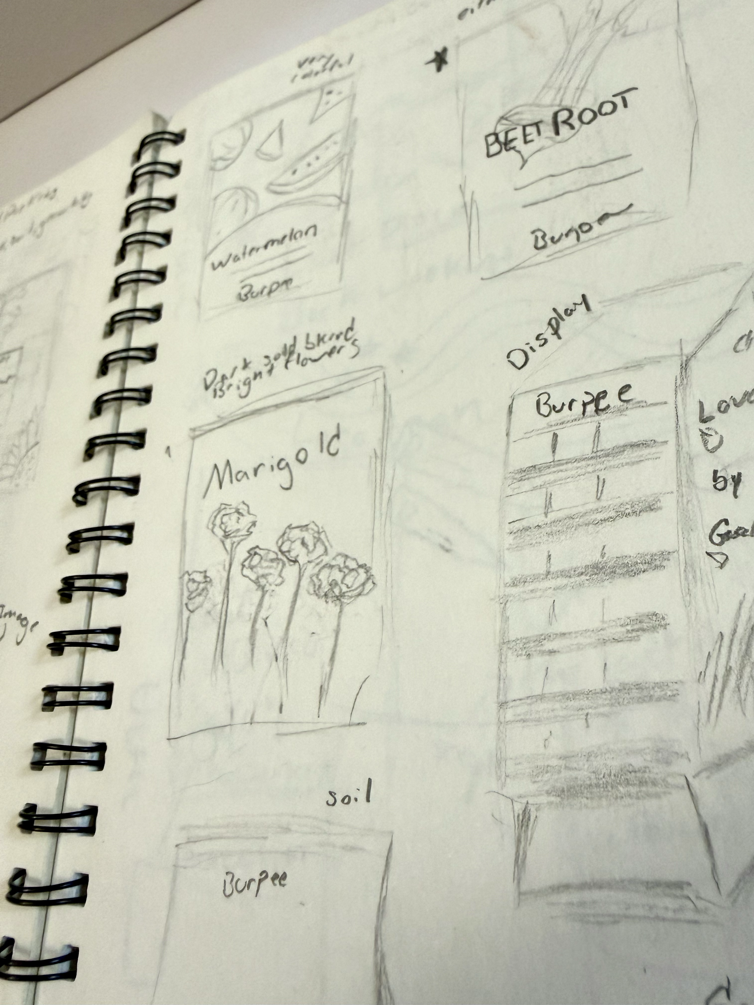
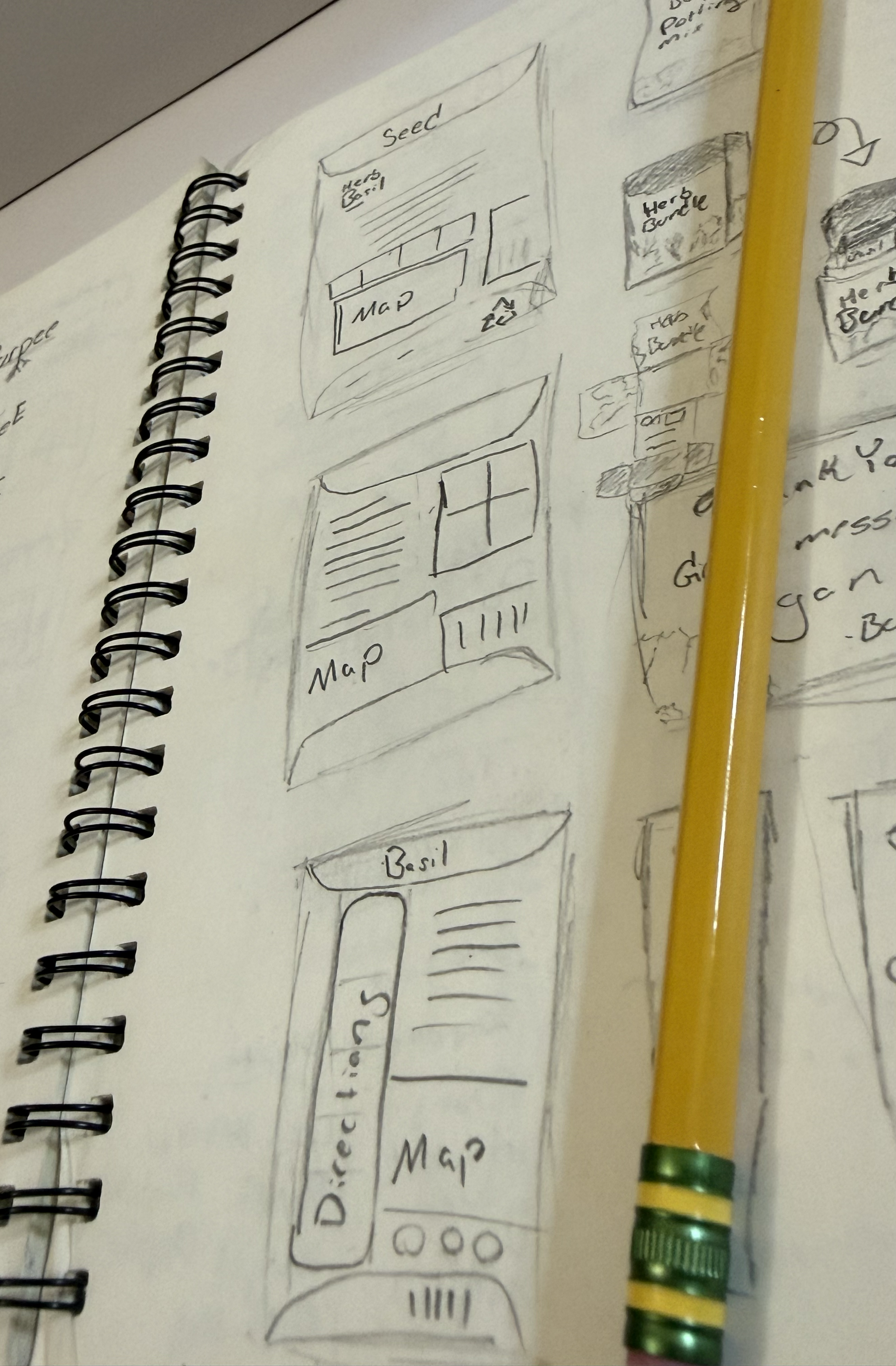
Research
I began by comparing competitor seed brands and doing visual research on Pinterest, Dribbble, and Behance. I looked at how different designs displayed the immediately necessary information (like the plant name and image) on the front and how other brands displayed more dense planting information on the back.
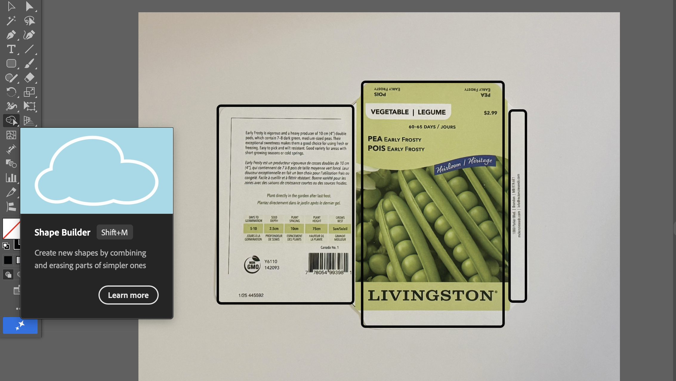
Creating the Dieline
On a trip to a local print house I was able to obtain an unfolded print of a Livingston seed packet. I used this as a base to create my dieline by measuring each side, translating those into shapes in Adobe Illustrator, and then combined them with the shape builder tool.
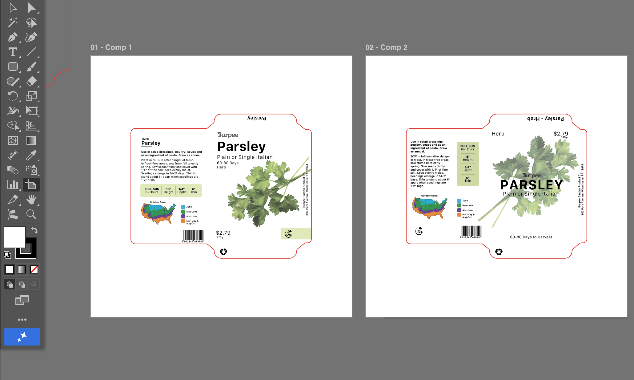
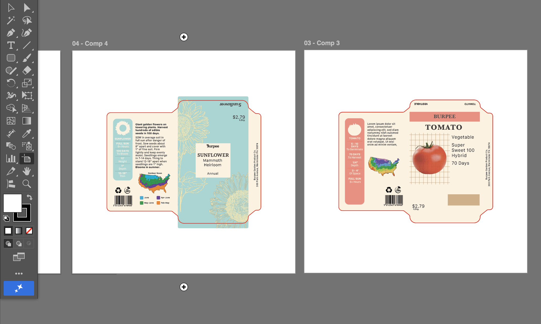
Iterations
I created multiple different comps with distinct layouts and color palettes based on my visual research. Creating in Adobe Illustrator, I tested these different styles until I decided on my strongest version, which I would refine moving forward.
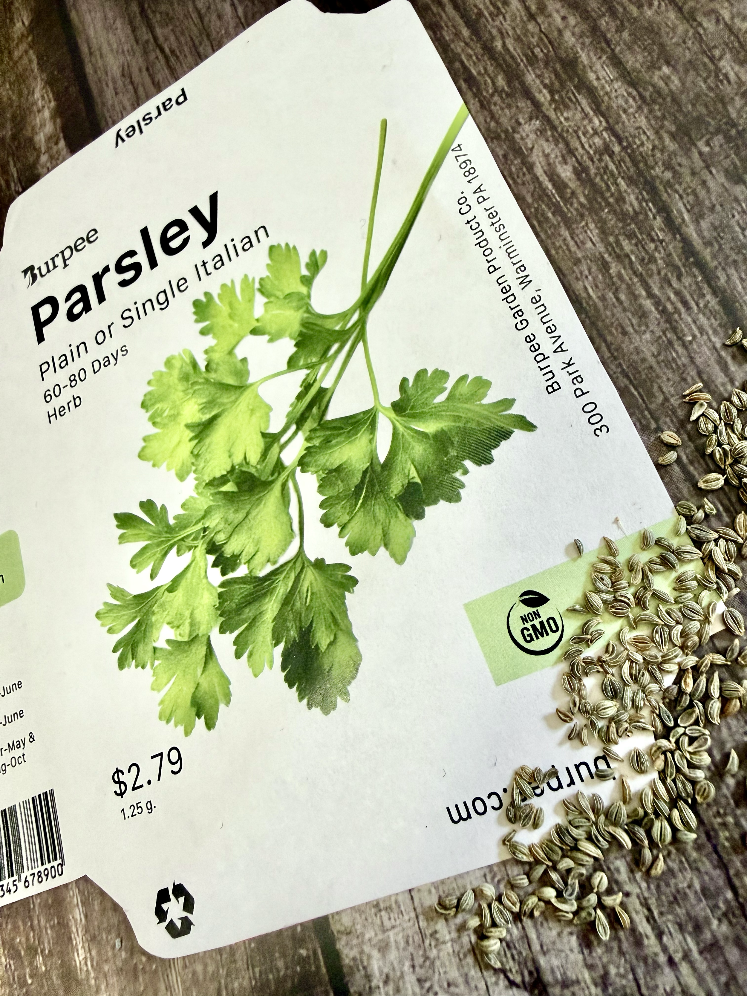
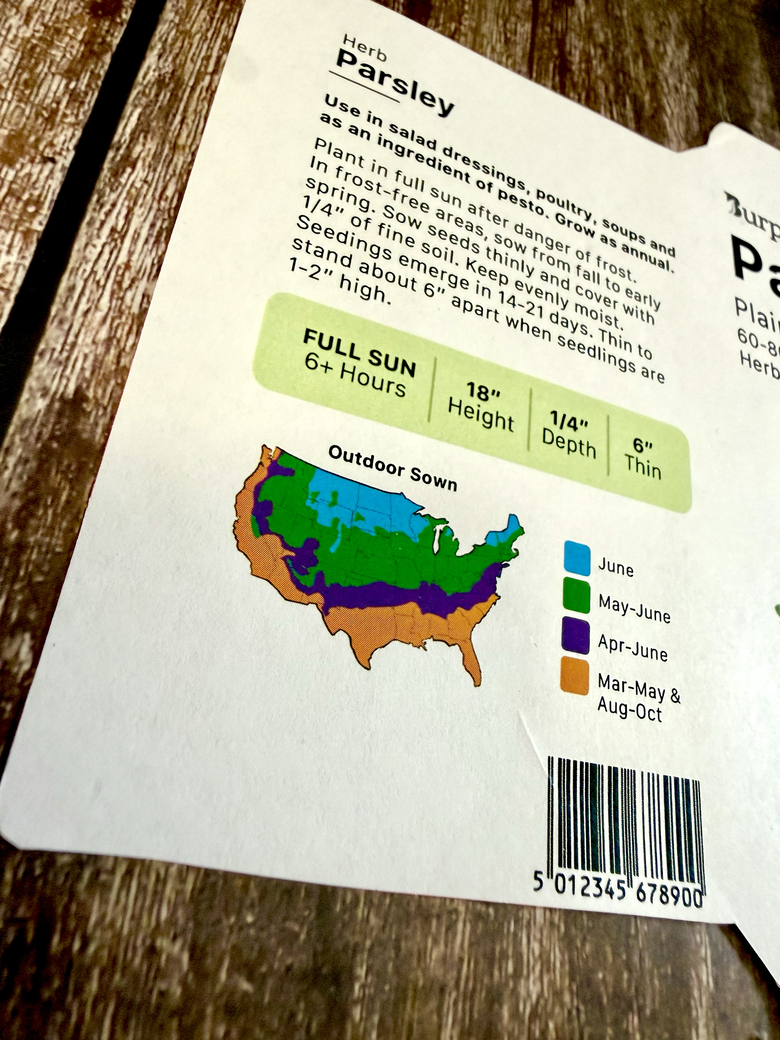
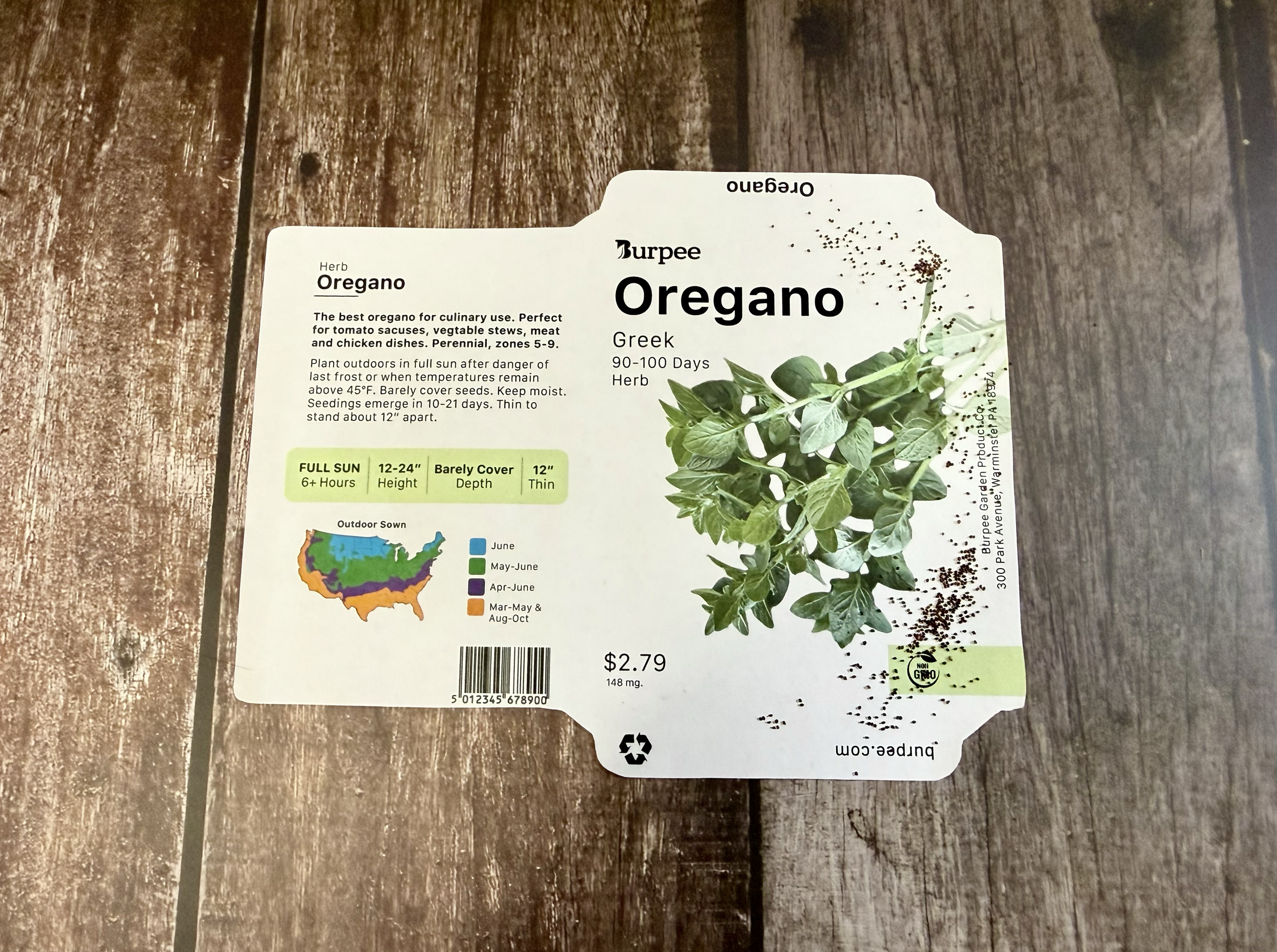
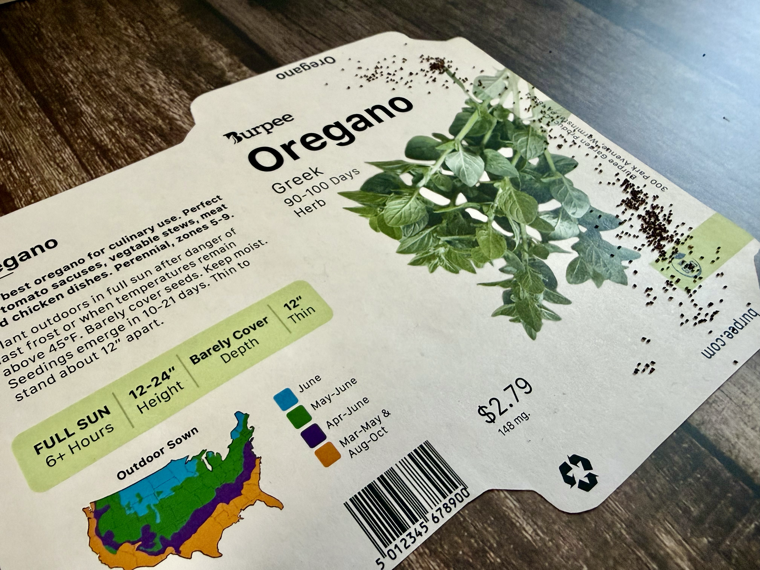
The Redesign
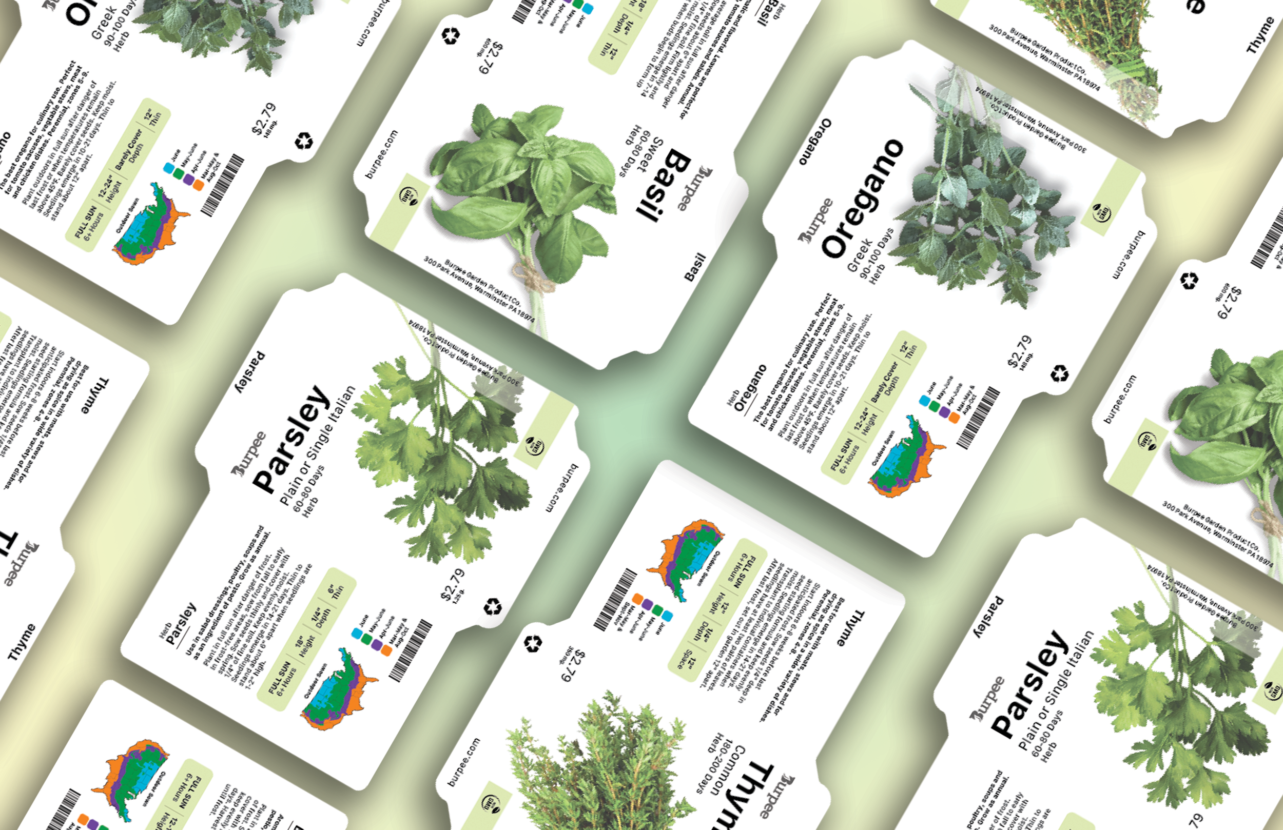
The packaging was redesigned to move away from its current dated aesthetic and toward a more modern, structured approach.
I aimed to:
Simplify layouts to reduce visual clutter
Create clear typographic hierarchy, prioritizing essential information
Maintain a consistent system across all packets
Use imagery more intentionally to draw consumers eye and support quick recognition
The new design creates a cleaner, more contemporary look while making the packets easier to scan and compare in a retail setting.
Reflecting
In the end I created four designs, all following the same structure, showcasing different herbs. Creating for multiple plants allowed me to focus on cohesion, creating templates to save time and avoid errors, and making similar but different information work in predetermined spaces.
Focusing on modernizing an outdated design helped me better understand how brands must adapt over time. I strengthened my ability to design with dielines, refresh brands, and design for real-world contexts like retail environments.
This redesign was my first deep dive into packaging design and an opportunity to explore a niche that has always called to me. Working on this reinforced my interest in the package design process and pushed me to think critically about how thoughtful updates can make a brand feel more relevant, accessible, and competitive.