
Penguin Random House's Playful Brand Extension
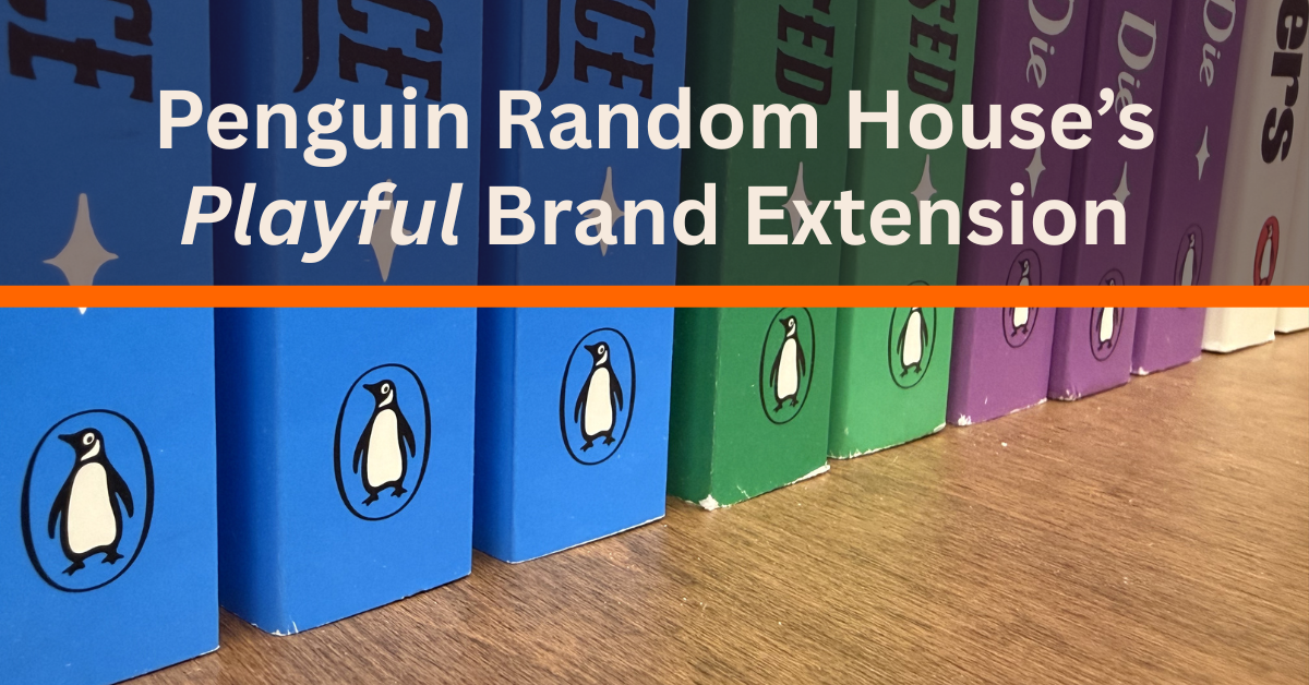
If you’re a reader, and even if you’re not, you likely are familiar with the little penguin in the orange oval on the spine of books. That little guy is named Alan, and he’s the logo and mascot of Penguin Random House. They’re a publishing company dedicated to igniting “a universal passion for reading” and providing their authors with “the greatest platform possible.” They are a major brand with a significant commitment to their authors and the communities they serve, and in 2026, they’re expanding.
Penguin's Visual Identity Evolution
Illustrator Edward Young created the Penguin Random House logo. He spent a day sketching penguins at the London Zoo on assignment from founder Allan Lane. Lane was inspired by his secretary, Joan Coles, who suggested “Penguin” as the name for the new publishing firm.
Young’s initial sketches evolved over the years with slight variations to become the iconic penguin on our books today. The original logo was tweaked and refined over its first couple of years. Then, in 1937, the logo turned its head from left to right and began to dance. This version was also refined a couple of times before Penguin decided to shift to a more “serious” penguin in 1939. In 1949, designer Jan Tschichold “redrew Young's original logo to create a version of the penguin,” with thicker black strokes, “that was used until 2003.” Tschichold stayed at Penguin for three years, where he developed guidelines for how the brand should be applied.
Today's logo is quite similar to what Jan Tschichold created. Only minor tweaks have been made, including angling Alan’s beak up slightly more, adjusting his feet to be flat on the ground, and making him 15% slimmer to better fit on the side of a book.
For Penguin Random House’s 90th birthday, they decided to add some more life to their brand. They uncovered archival assets that featured a “rich collection of expressive illustrated penguins from our Bristol archive,” says design director Derek Man. These fun penguins were integrated into their anniversary campaign, and they were a hit. Alan had been stuck in his orange oval to maintain brand consistency, but this was a sign to let him out.
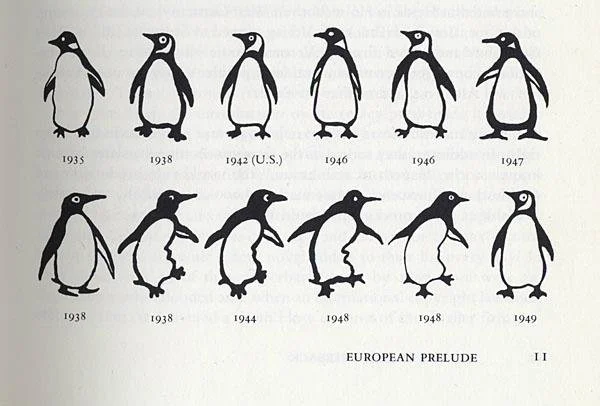
The evolution of Penguin Random House's Logo. [Credit: Peguin Random House]
What They Did
Penguin Random House UK didn’t take this opportunity to rebrand. Instead, they used it to expand their brand. Introducing a new cast of characters, The Playful Penguins. Illustrator Matt Blease was brought in to make them come to life. While studying the movement of real penguins, Blease created an extensive cast of fun and expressive penguins that have the freedom to move however necessary, whether it be dancing, sliding down the ice, or, of course, reading.
These penguins are not meant to replace Alan; in fact, they aren’t even the same bird. It is very important to Penguin to keep their strong brand identity. That is why Matt Blease imagined them to be more like family, and could conceivably be “guests at Alan’s wedding.” This addition is meant to be “a modular library of characters that complement the icon, not compete with it,” explains designer Ryan Selvy. The Playful Penguins give the brand more flexibility without compromising their recognizability.
The Playful Penguins are starting to be featured everywhere, from socials to tote bags, from book carts to large displays.
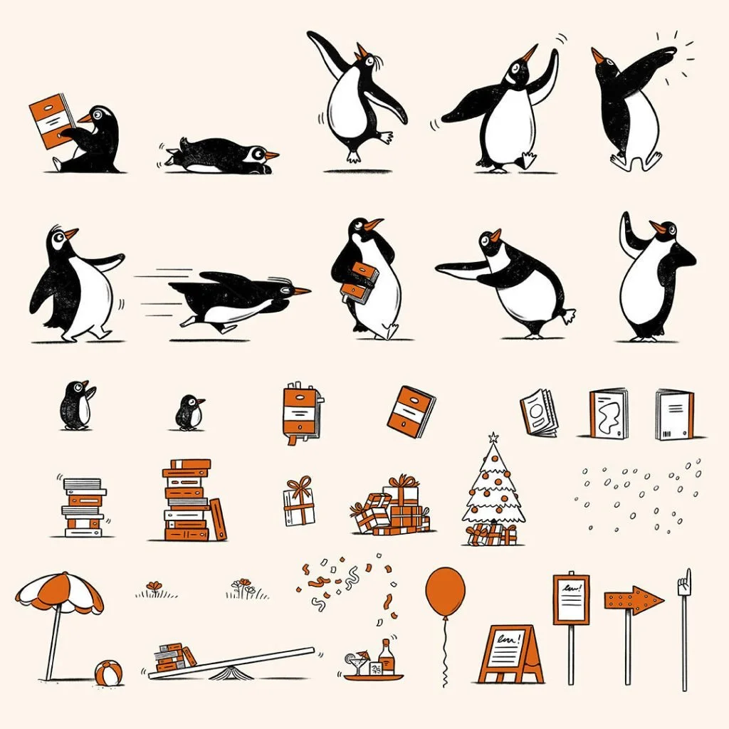
The Playful Penguins illustrations. [Credit: Peguin Random House]
Why This Works
The “Playful Penguins" extension is especially effective because it bridges brand consistency and creative expression. The official logo maintains the company’s heritage, while the illustrative penguins allow designers the freedom to create without diluting the core identity or worrying about breaking strict brand guidelines.
This flexibility fosters a welcoming, approachable tone that appeals to consumers. Leaning into this whimsy allows the brand to become more than just a publisher; it humanizes them. They feel more inviting, more relatable, inviting their consumers to engage with the brand as they pick up a book.

Hi, I’m Sophia. I’m a graphic designer who’s passionate about creating intentional, strategic, and eye-catching designs. From brand identities to motion graphics and from stationary to large displays, I’m here to help translate your what’s in your mind to an effective and eye-catching final product.
Let’s make something great!