
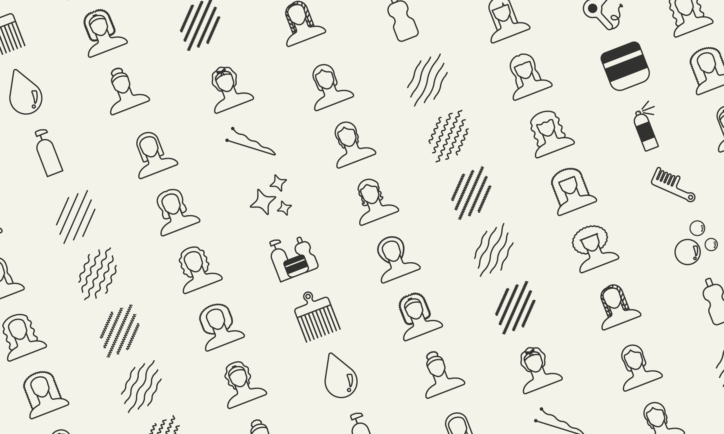
Hair Types Icon Set
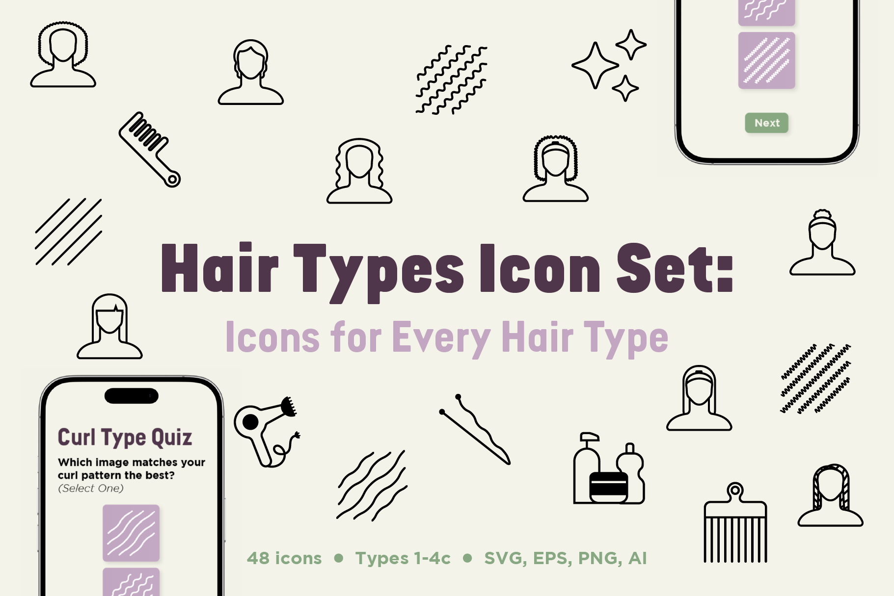
A 48 icon set containing every type of hair from 1 to 4c, plus the tools that go with them. It aims to provide people with the resources they need to give people with curly hair representation.
Role
Graphic Designer
Adobe Illustrator, Google Docs, Sketching Gumroad.
Timeline
7 weeks (2026)
Project Type
Icon Set, Digital Product
Tools
Background
For seven weeks I went through the process of developing, designing and launching my own digital product. The product I chose to develop? An icon set representing a wide variety of hair types.
But why did I choose to make it? As someone with curly hair I know the struggle of never seeing yourself in the media, especially in the beauty industry where straight hair is the norm. In addition to that I’ve run the social media account for a curly hair salon and I know the struggle of not having a wide variety of resources at your disposal to represent our customer base. These two parts of my life inspired me to close the gap and create resources for creators in the curly hair space.
This product is currently available for purchase on Gumroad!

How We Got Here

The Problem
Anyone without straight hair will tell you about their struggle with the lack of representation for them and their hair. At a glance at the beauty industry, you could assume there’s one type of person. That person likely has pin-straight hair. That couldn’t be further from reality. Hair comes in all shapes, patterns, sizes, and styles. There is not just one type of hair.
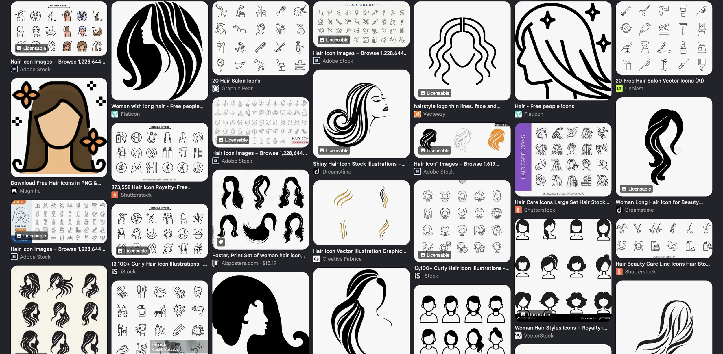
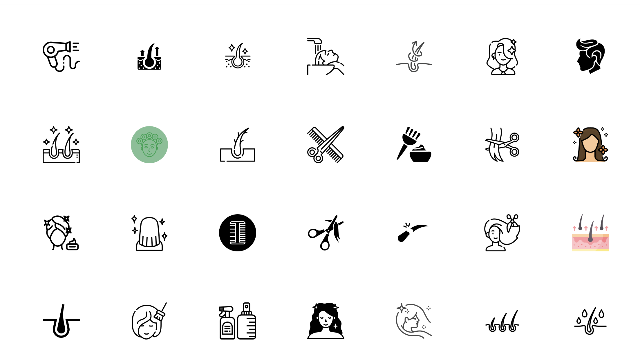
Say you’re working on a product for someone with textured hair and want visuals to represent a hair type other than curly, good luck! You’ll likely come up empty or with very few results aligning with what you need. Social media managers, stylists, packaging designers, cosmetology educators, and UI/UX designers alike are left with very few resources. They have to mix and match different sets that don’t belong together and spend hours upon hours creating visuals themselves, which wastes time on tight schedules.
To solve this problem, I created an icon pack, encompassing all of the major hair types (1-4c) to provide a resource that eliminates the problem of mixing and matching and wasting time you don’t have. The pack contains different lengths, styles, tools, and patterns to fit a wide variety of use cases from print to digital.
The Objective:
To create an icon set that can be used as a resource for anyone creating materials directed toward people with curly hair. To provide a wide variety of options so creators aren’t stuck in a box. And to create cohesive icons with matching line weight that stop whoever is using them from wasting their valuable time.
Market Research
Product Landscape
Before I even landed on my icon set idea, I had to see what was out there. Honestly, when creating a digital product, I didn’t know where to begin. Surveying the product landscape helped me understand what other sellers are doing and what sort of products people are selling.
I identified niches I wanted to explore. The products that stood out to me were primarily in the “design resource” category. Being able to create something for designers like myself really appealed to me. After all, if I could see myself wanting or needing a product, then I couldn’t be alone.
I also observed some trends, the biggest of which was AI-generated products. These felt cheap, like the seller was trying to make a quick buck off of me, like they didn’t care one bit about me or my needs. In turn, the products that stood out to me most were made by hand. Handwritten typography, hand-stitched photo overlays- they all felt so unique and appealing. In a market saturated with soulless products, something so undeniably human felt so refreshing.
Competitive Analysis
To get a better idea of exactly how my competitors went about their sales pages and process, I looked at three products in depth on Creative Market. These products were a hand-lettered typeface, a paint overlay pack, and a set of hand-drawn woodland icons. I poked around, noted what I liked, what stood out, and nitpicked what I thought the products could improve upon. This got me thinking not just about designing the product, but what actually went into marketing it, putting me in the right headspace from the beginning.
Target Audience
At first, I struggled to define my audience. I was thinking about myself, someone with curly hair, who doesn’t see hair that looks like mine represented in the beauty industry. Instead, I should’ve thought of myself as the creator, who needs resources to create that sort of representation for customers. Once I shifted my perspective, it became a lot clearer. My audience is anyone in hair services, especially people with curls. They’re the ones designing the packaging their products arrive in. They’re the ones developing the interfaces to help users find the right products. They’re the ones creating the content around and teaching others about hair.
Preliminary Validation
My final step in the market research process was to see what customers were saying. For this, I looked at reviews and online forums like Reddit. The positives: people really valued high-quality products that could be used in different scenarios and could set the brand apart. People worried about file sizes and a lack of variety in the product's offerings. I kept in mind the need for consistent assets, the value of offering different variations or premade compositions, and the importance of naming my files well.
The Pitch
The Ideas
Before starting development on an idea, I first pitched it to a group of my peers. I came up with three very underdeveloped ideas:
A beauty icon set displaying different hair and skin types
A pattern pack inspired by real tile found around the world
A paper cut-out PNG pack to spice up designs
In my pitch, I gathered information on the target audience, the problem, how my product would be a solution, what would come in each product, and why it was unique. I also mentioned where I’d sell the product, for how much, and at what point I would consider the product a success. I created a presentation and recorded my pitch, which you can watch to the left.
Feedback
The feedback on my pitches was pretty positive, with people saying they thought each product idea could have a great outcome. Overwhelmingly though, people felt I should move forward with the Beauty Icon Pack. Here’s what they said:
“As a fellow curly-headed girl, this definitely resonated with me”
“I think your first idea is really strong and necessary. So many people could benefit from those icons even outside of the target audience.”
“I feel like this one has the strongest purpose behind it because you're trying to make [the icons] more inclusive of different hair textures.”
There was an undeniable opportunity here to reach a largely untapped market and make a product creators need but don’t have many options for. So, I decided to move forward with the Beauty Icon Set.
Production
Ideation & Sketching
The first step in my production process was to decide exactly what I wanted to make into an icon, so I created a mind map. I started with my central topic, a beauty icon pack, and branched out from there. I had four main branches in the mind map: hair, skin, makeup, and general. As I went through, I realized that I’d cast a very wide net with my icon selections. Perhaps too wide? I worried I wouldn’t be able to offer the level of detail and variations I had envisioned if I kept my subject so broad. So I pivoted. Instead of a general beauty pack, I decided to zero in on the hair branch since that’s what interested me most from the start.
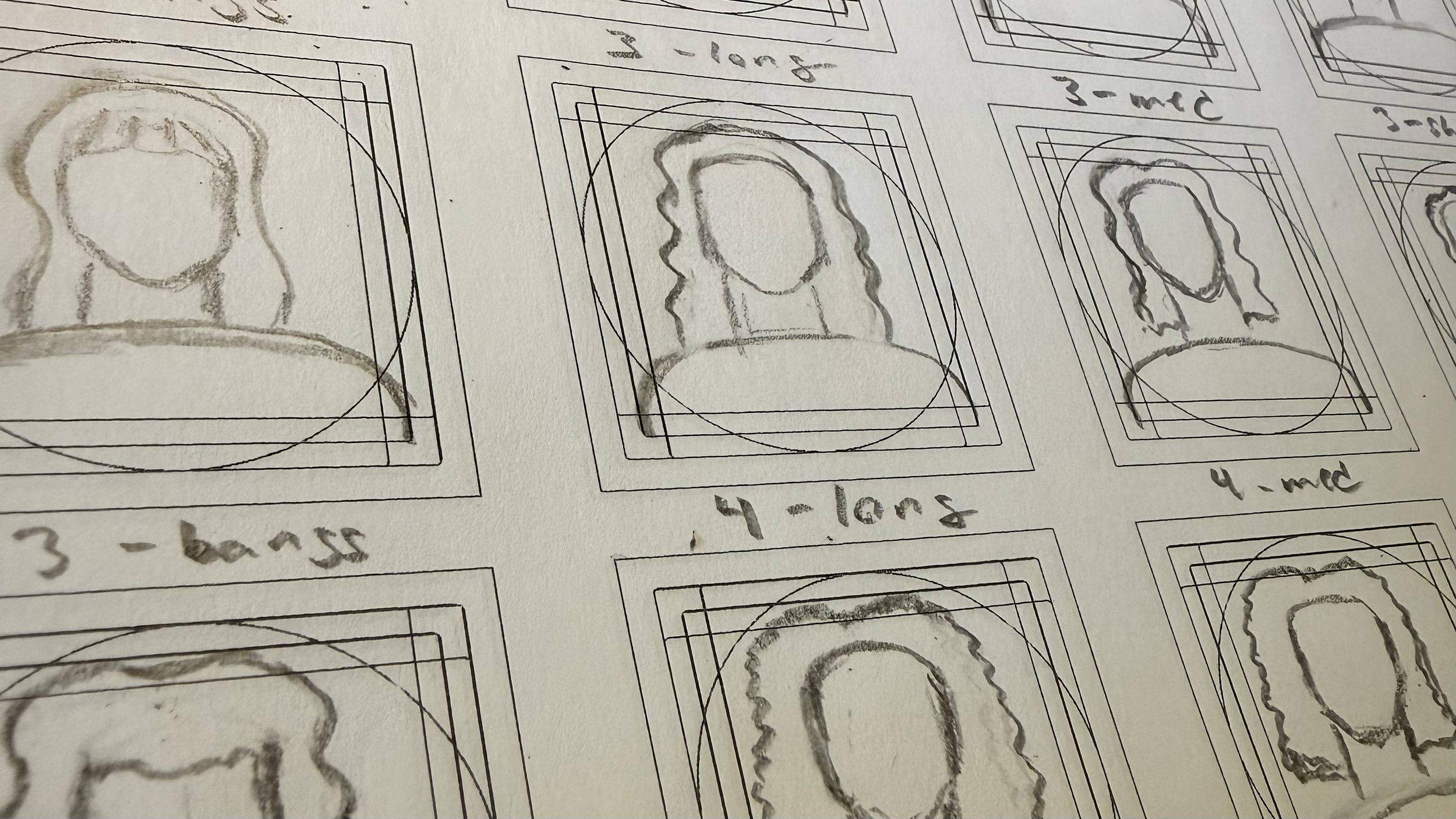
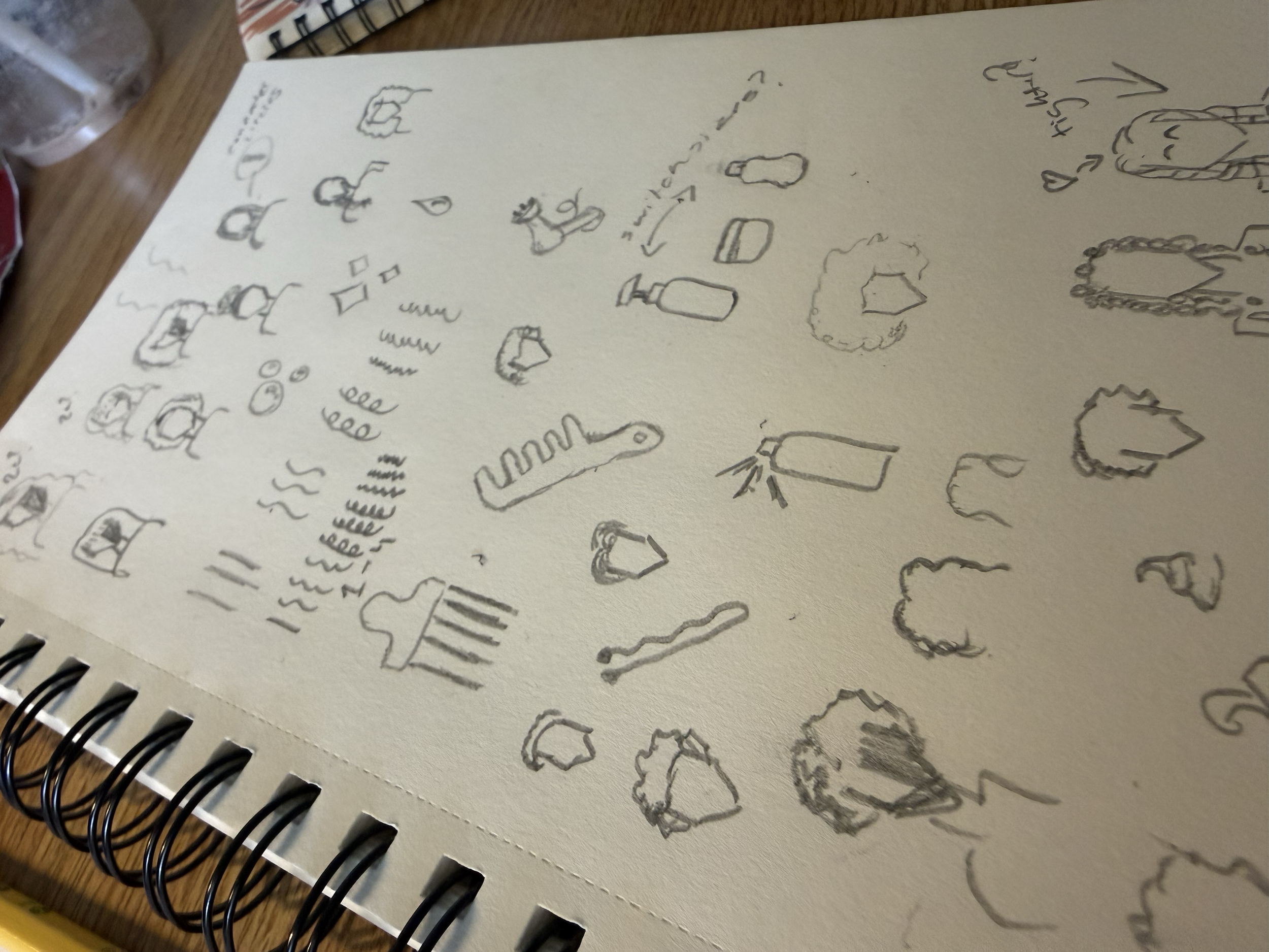
Once I decided on my pivot, I started sketching. I sketched every icon twice, once messy and once a little more carefully. The purpose of the initial sketch was to get the ideas out of my head and onto paper. This allowed me to test out different variations and icon styles before fully committing to them.
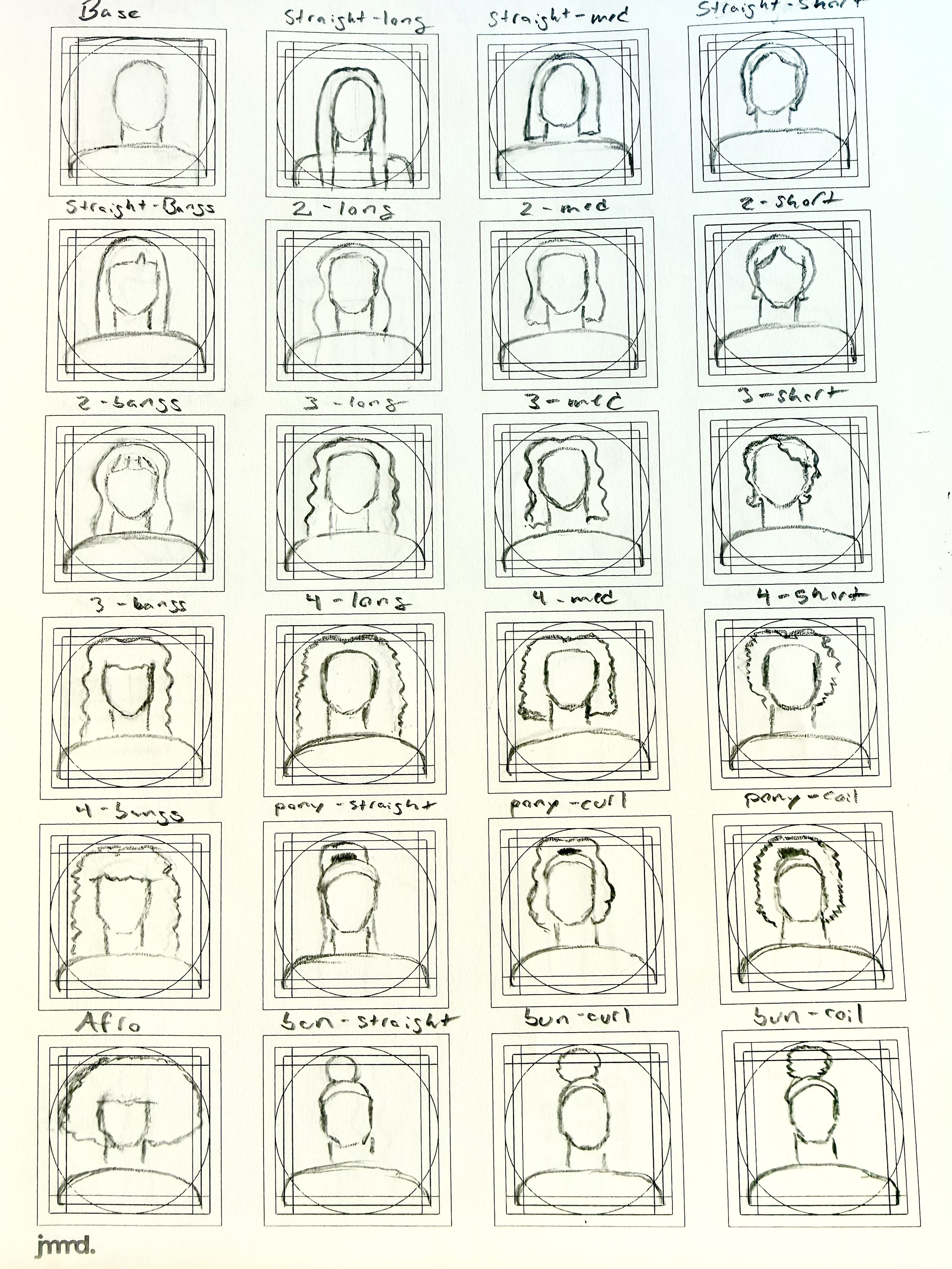
My refined sketches were much more intentional. These sketches are what I’d transfer to my computer. I used a grid system I downloaded from the creator: jammed. This system ensured each of my icons felt visually balanced and cohesive by including space for icons of various orientations.
Vectorizing
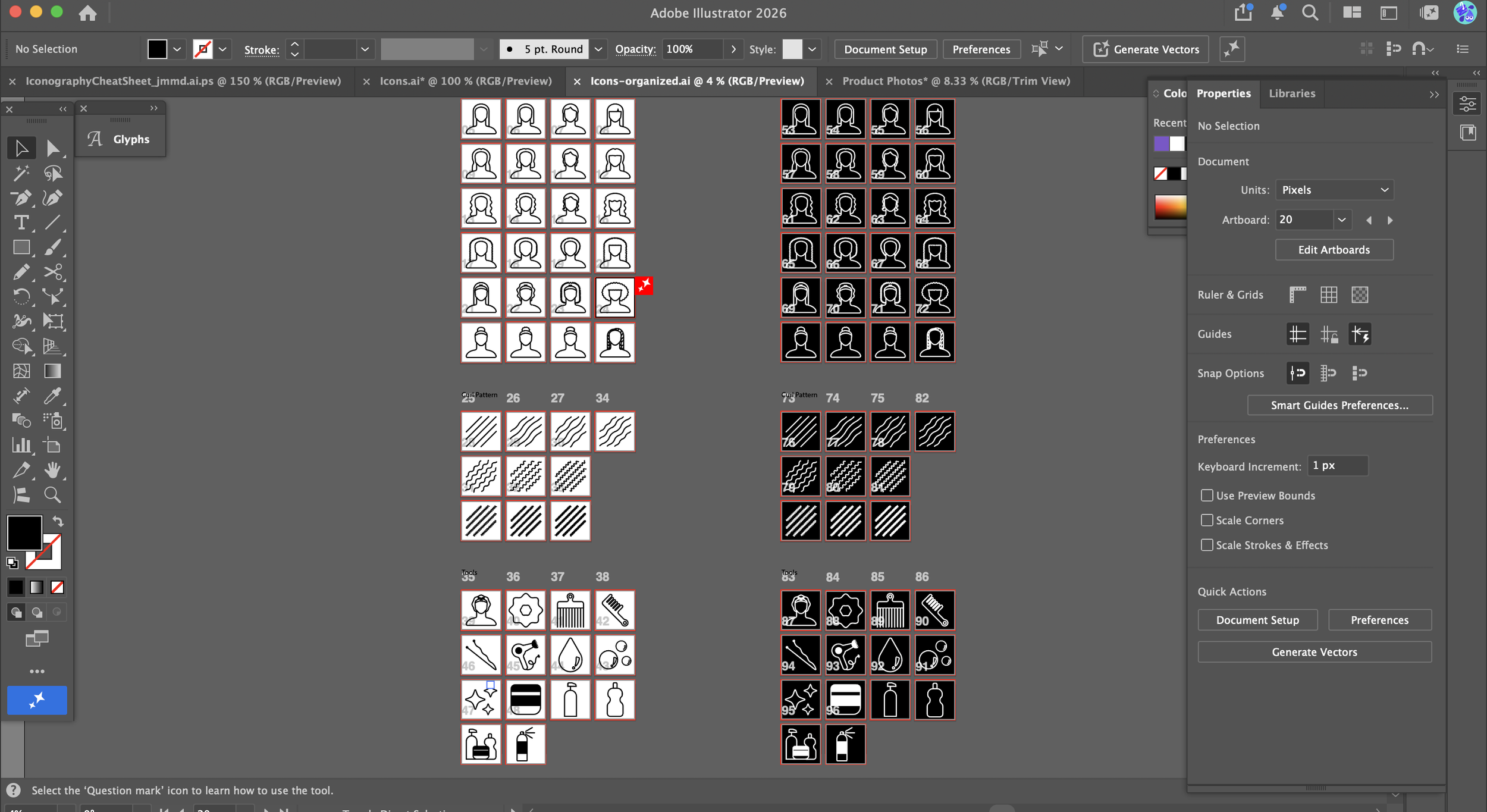
To vectorize my sketches, I brought a photo of my sketch into Illustrator to create the base for my personal icons. Each hair type and style would sit on the same “person” graphic, so naturally, establishing that was the first step. I used different shapes and adjusted anchor points and corners until I had a base I was happy with. From there, I went through each curl pattern grouping, creating icons for long, medium, and short hair. This ensured there’d be lots of variety and would result in a product customers could see themselves in. In the end, I created 48 icons, including 24 hair types and style variations, 10 curl pattern icons, and 14 hair accessories, tools, and other miscellaneous icons.
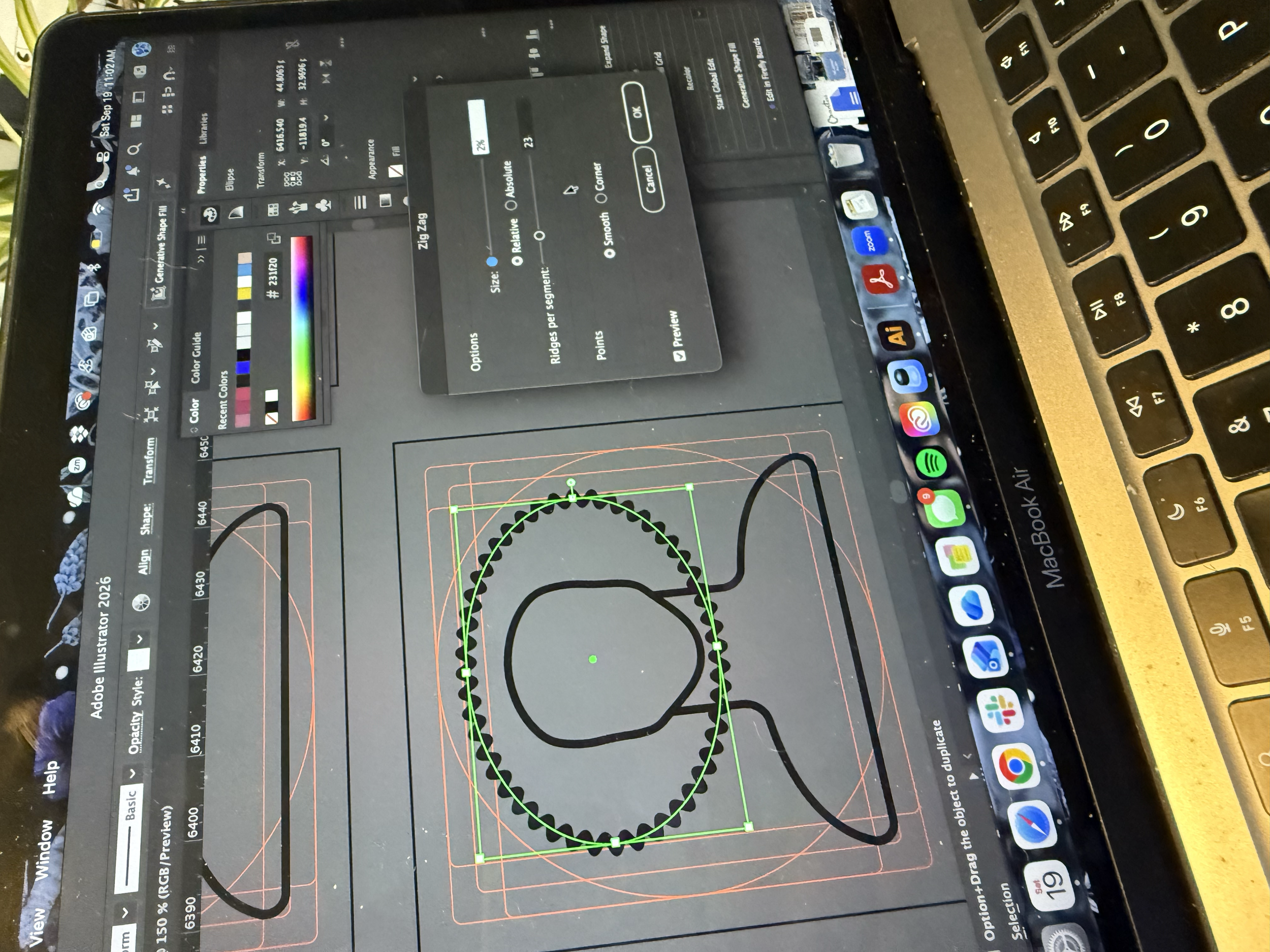
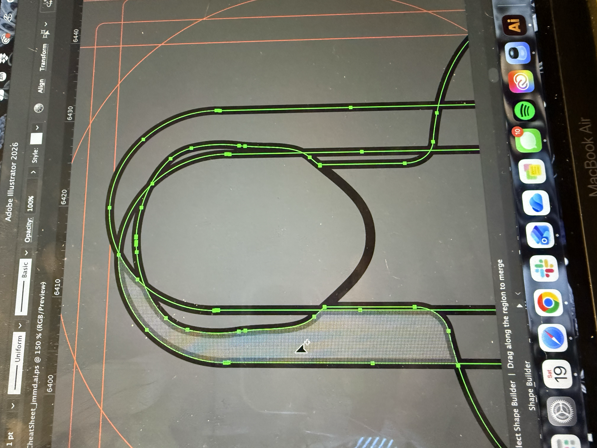
Throughout my process, I used the Pathfinder, Zig-Zag effect, and Shape Builder tool. I’ve used all these tools before, but I was a little rusty, so it took a bit of a learning curve before I got comfortable again. A new technique I discovered was using the Pathfinder tool and circles to cut out chunks of the hair. Once it adequately looked like Swiss cheese, I then rounded the edges to create larger curls. This allowed me to have a little more control over curl placement.
Refinement
After my first pass, I asked myself, am I representing a wide enough range of hair types? The curls in the 3 hair type section are most similar to my own, which are looser and at the beginning of the 3a-3c range, so I worry it does not accurately encapsulate the texture range. As for the icon scale, I worried smaller details may not have been clear at a smaller size, especially for the curliest hair types, since the coils were so tight that from far away they began to look straight.
When I refined my icons, I added one more kink in the curl pattern. This made the icon feel like a better medium in the 3-curl pattern range. I also tried a second variation with more kinks, but this first variation fit the range and icon set better.
Next, I made sure all the icons were clear at lots of sizes. I shrunk each icon to the standard size: 24×24 pixels. I made a few edits to the coily hair icons to make sure you could still see the curls at that smaller size. To do this, I adjusted the number of kinks with the zigzag effect so there were fewer ridges per segment. The curls appeared more defined in the final product. Combined with a wider, more voluminous hair shape, makes the icons clear even when you can’t see intricate details.
Packaging
Description
The first time I wrote my description, it wasn’t anything crazy. It mentioned what was included along with some simple recommendations. What was lacking in the first draft was really the who and the why. I didn’t really mention who I hoped to sell my product to. My language was directed to the end customer, not the creative who would actually be using the product. I updated my copy to include those actually using the product, like hair-care and beauty brands, salons and stylists, app and web designers, content creators, educators, and cosmetology instructors. I also included why they were using it, such as for apps and websites, curl quizzes, salon service menus, packaging, worksheets, informational guides, social media posts, Instagram highlight covers, and more.
Images
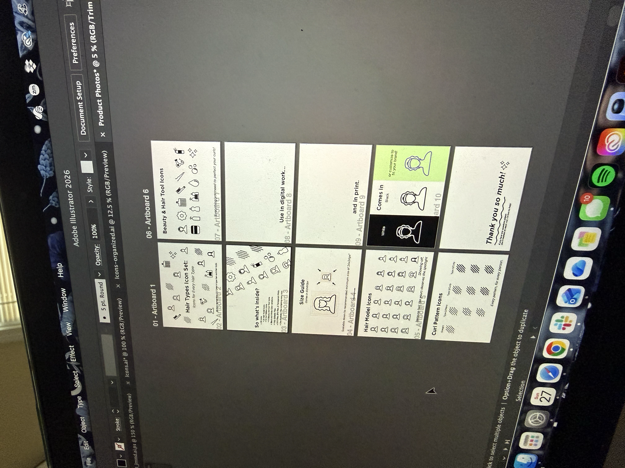
The images were one of the most important aspects of the sales page. They'd be the first thing my customers saw, what they’d click through before reading my long description. I created the main image with the title of the set along with a mockup of a curl quiz. Then I created three images of each subcategory in my set and labeled each of them so you could easily identify each icon. I included a size and color guide showing the icon at different sizes, with different stroke weights and in all the colors it comes in. To round it out, I created a few mockups like websites, social media, packaging, and hair service menus and listed some use cases, then noted the different file formats and license types
Platform
Originally, I decided I wanted to sell my icon pack on Creative Market. I felt the site’s curated space meant I’d be able to reach a lot of potential customers. What I didn’t realize at first, though, is that you had to apply for a Creative Market shop. I unfortunately was denied. So I had to pivot and I moved the set to my backup site, Gumroad.
Making the switch from Creative Market to Gumroad was easy, but it wasn’t seamless. There were a few tweaks I had to make to my product. First of all, I could make my price a little lower since Gumroad would take a smaller chunk of my earnings than Creative Market would’ve. I edited the description, which included some Creative Market-specific language. Then, I made a quick thumbnail image to show off the product on my profile.
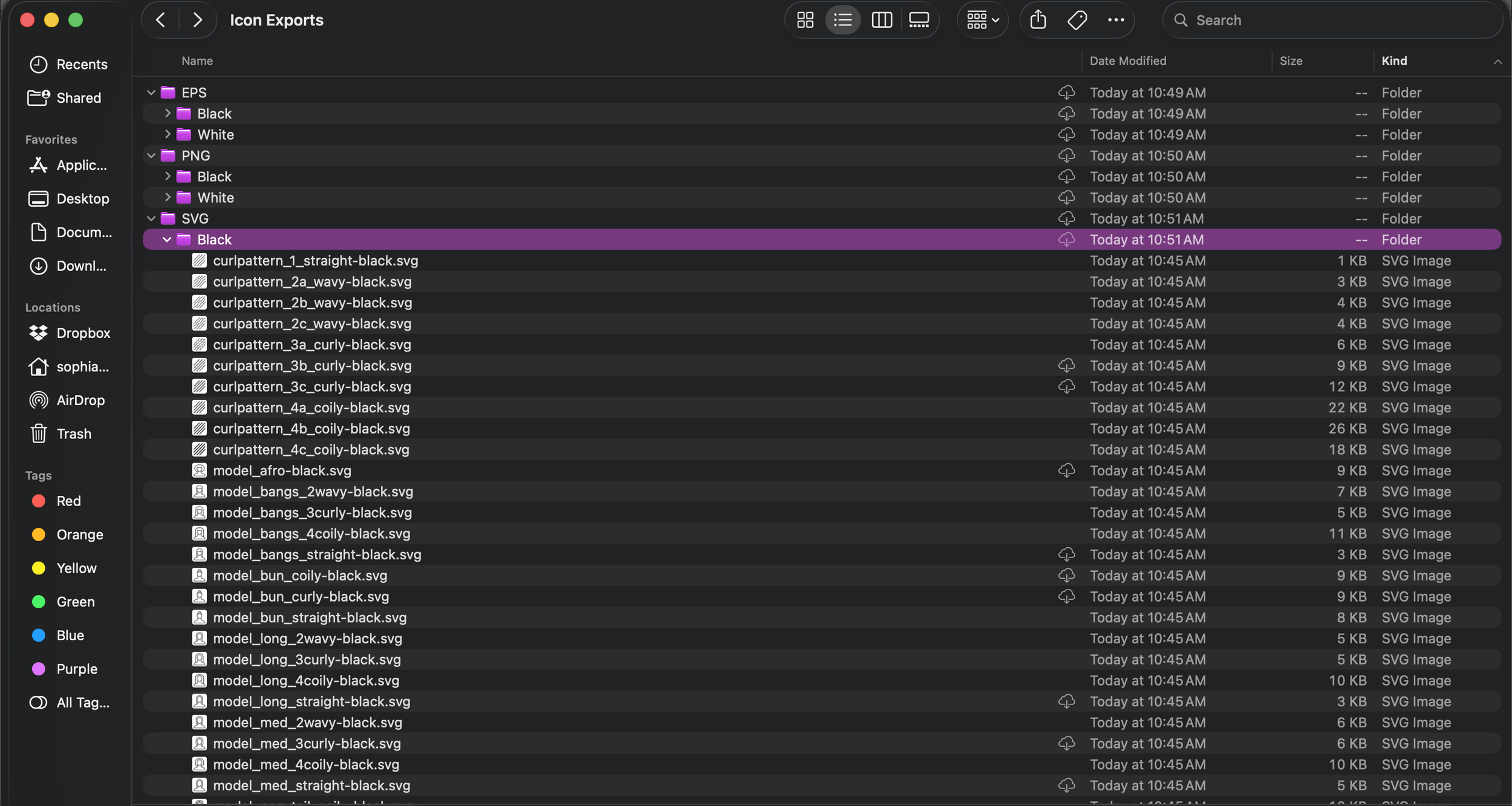
Dig Deeper into my Production Phase


Reflecting
Only time will tell if this product is a success. No matter the outcome, though, it will have been an incredible opportunity to learn about product development in the digital space. Before this venture, I had a very limited view of options for what I could sell online. I had always been interested in selling my own product, just never found a product idea that inspired me until this.
This product gave me a new perspective as I designed resources for people other than myself to use. There was no “I’m the only one who will ever see this, so this is good enough.” I worked to refine past the standards I’d typically have for other personal projects.
It’s also led me to think about the sales and marketing side of a product. What goes into a good description? What makes people click on a product? What makes them actually decide that it’s worth their money? I had never put much thought into this before, and it’s a lot more difficult than I anticipated. This project pushed me out of my comfort zone, making me learn something new in a discipline separate from my own.
I put so much hard work into this project, and while I hope to make a sale, this process has been such a great opportunity. It’s led me to want to create more. I now have so many ideas swirling around in my head that I hope to make a reality.