
Looking Back: Cracker Barrel and the Importance of Brand Loyalty in Design
In August of 2025, Cracker Barrel, a rustic, eclectic and homey chain restaurant serving American southern classics, rebranded for the first time ever. A week later they changed back to their original design. What went so wrong? Let’s take a look.
What Happened
On August 19th, 2025 Cracker Barrel launched their new rebrand, showing off their new and improved logo. They also planned to roll out a more modern look for their restaurants, with more white and less old-timey clutter. Instead of praise they were met with intense backlash.
People on social media called the rebrand "soulless" “bland” and “generic.” There was outcry for the abandonment of the former logo’s iconic Uncle Hershel. They felt all the personality that Cracker Barrel is so well known for was stripped away.
In the following days, Cracker Barrels stock plummeted with “the company losing $94 million in market value” on August 22nd, says CNBC.
On August 25th, Cracker Barrel released a statement saying, “We could’ve done a better job sharing who we are and who we always will be.” And by late August/early September the original logo was reinstated.
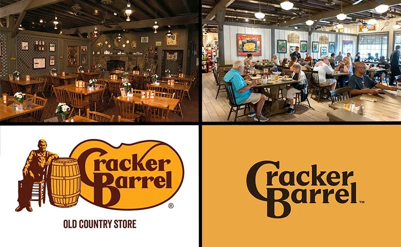
Image Source: AY Magazine. Cracker Barrel is Serving a Fresh Look -- What Do You Think?
Not About the Logo
While on the surface the outrage may seem like it’s coming from people not liking the logo itself. In reality, this controversy isn’t about the logo at all.
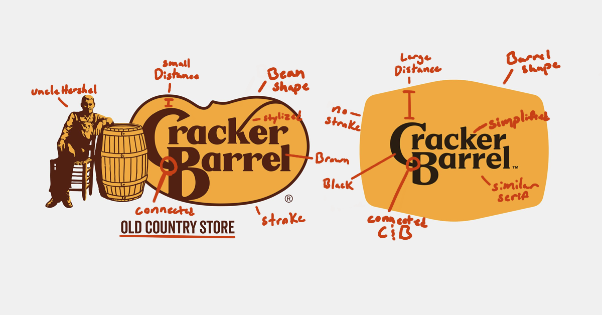
The logo is technically well done with a lot of thought behind it. It’s clean, it’s modern, it uses a similar typeface and letter customization with the “C” connecting to the “B.” It even pays homage to the original logo with the frame around “Cracker Barrel” representing the barrel in the original logo.
Cracker barrel, which has an older demographic, wanted to appeal to a new, younger, audience. For what they were hoping to achieve, I believe the logo is a pretty good modernization of the original. It pushes them toward their goal of attracting a new audience into their restaurants.
The problem then, is that current customers felt alienated and pushed aside by this rebrand. Patrons felt abandoned and like they weren’t being seen.
Abandoned Brand Loyalty
If you go into a Cracker Barrel, you know what to expect. Every restaurant is the same, the same photos and objects are on the wall, you know exactly where to find the bathroom. The logo has never once, before now, been updated. It’s familiar, it feels like home.
“Cracker Barrel didn’t just change the look of their logo,” says designer and Youtuber Will Paterson, “They changed their customers’ perception and perspective on who they are.” Cracker Barrel fans felt the brand no longer represented the rustic, vintage, and warm feel they came to love, it instead felt cold.
In trying to reach a new audience they forgot about their current one and why people resonate with it. They forgot about the emotional connection so many Americans had to their traditional southern restaurant.
“Unless it consistently represents the aims and beliefs as well as the total activity and production of a company, a corporate image is at best mere window dressing, and at worst deception”
Something as simple as a coat of white paint and an updated logo makes it seem like the chain is neglecting who they are and what they represent. It makes their rebrand feel like a cheap money grab instead of a well meaning update.
Cracker Barrel is a perfect example of why it is so necessary to back up brand decisions with strategy and what can happen when you don’t.
Are there any other brands you think are almost untouchable?

Hi, I’m Sophia. I’m a graphic designer who’s passionate about creating intentional, strategic, and eye-catching designs. From brand identities to motion graphics and from stationary to large displays, I’m here to help translate your what’s in your mind to an effective and eye-catching final product.
Let’s make something great!